It is likely that you have seen the CYLO 1 bike, designed by former Nike design director Eric Duvauchelle and his brother Antoine in collaboration with Arro-Studio. The bike was covered earlier this year by several of the big design and gadget blogs and was featured on the cover of the October Wired Magazine issue. With this post though, I want to get a little deeper into the design of the bike, and give you a brief glimpse into the development process that led to the final solution.
As is usually the case with a design project, the Duvauchelle brothers started by defining a problem statement:
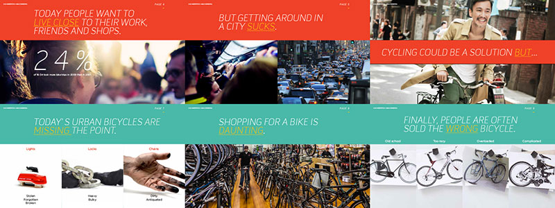
“Today people want to live close to work, friends, and shops, but getting around in a city sucks. Cycling could be a solution, but today’s bicycles are missing the point. Shopping for a bike is daunting, and most bikes often end up looking like Mr. Potato Heads once you attach all the gizmos like lights, fenders, racks etc …”
To address the problem, they came up with a list of “must haves” for the new design:
- Durability from daily city abuse, locking the bike up, dings, run-ins, heels, kicks, scratches, hot coffee, etc…
- Fenders so you can ride all year with no qualms
- Lights preferably without battery needs (front and rear lights, turn signals if possible)
- Gears (easy reliable, and silent)
- Able to use commonly available component parts (shifters, brakes, saddles, tires, chain/carbon belt drive, etc…) to simplify maintenance and enable riders to take their bike in any bike store for repair.
- Racks for cargo baskets (front and back options)
- child seat adaptability
- Tires that can hold cargo weight, but also easily sourced, replaceable and look good
- Reliable braking system in the form of disc brakes
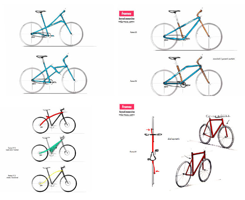
With the list of needs in mind, Arro started sketching the first quick design concepts. The intent was to create a bold design, as the slide above illustrates. During that first phase, no limits were placed on the concepts, and (in their words) “some of them were pretty out there.” One of the 100 or so early sketch forms was a design that they immediately liked (see the upper left sketch above). “ It was sporty, elegant, practical and fresh.” They also explored more traditional diamond frame forms (top right sketches), but didn’t feel that those ideas had that edge.
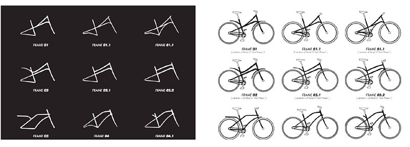
In the second phase, they wanted to narrow down a few of the frame designs that had been identified in the first round of sketches. The drawings above show slight variation on three of the forms identified in phase 1. The Duvauchelle brothers point out that “looking at the negatives helps to contrast the shapes, while the versions with the wheels helps to visualize now it might look in the end.”
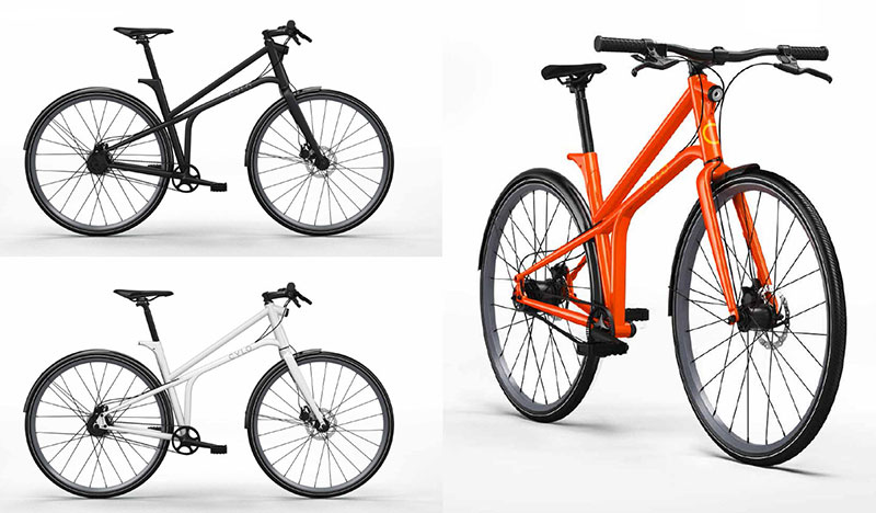
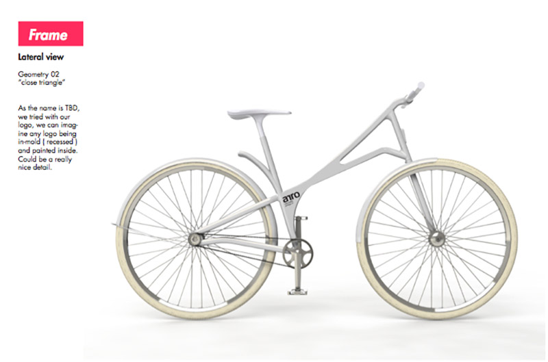
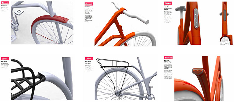
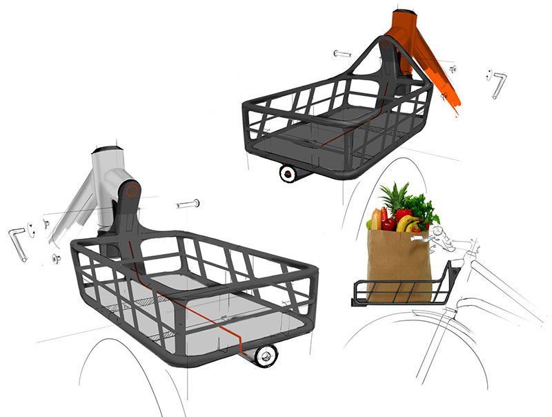
Once a form direction was chosen from the refined sketches, they began the process of refining the design. Using CAD and 3d printers, they were able to “iterate many different variations of minute details until (they) got a product (they) fell in love with.” This was also the stage to focus on details and to play with different accessory compositions, as seen in the renderings below.
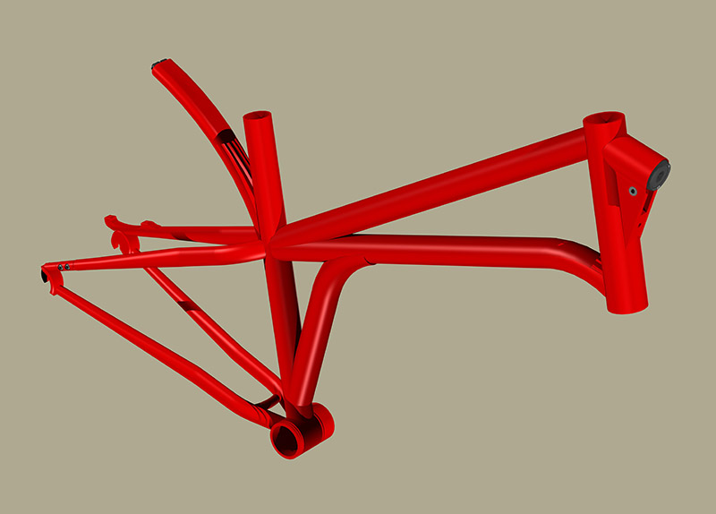
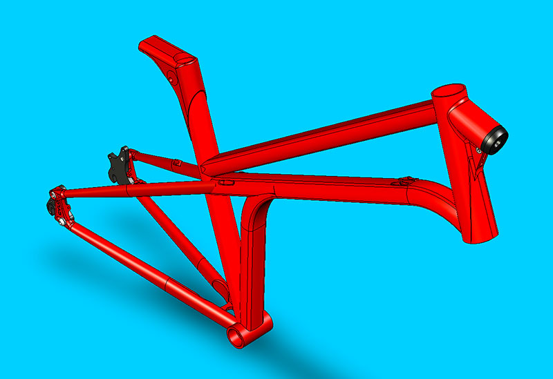
The next phase was engineering. The Duvauchelle brothers knew that the overall shape and design intent was where they wanted to take the brand, but they also knew that the radical frame design would require some “reality” in engineering to make it rideable. As they explain, “Our engineer has over 20 year of experience designing bikes and he helped us tremendously trying to achieve our design goal while also making a rideable bike. Lots of debates were had in this phase of the product development, as we knew we didn’t want to compromise our design too much, all the while knowing that we had to make it real. Below you can see some of the iterations of the frame engineering and concepts that we had.”
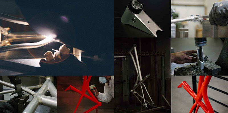
After working out many of the details in CAD with the engineer, the next step was to build the first rideable prototype (seen in the images below) with the help of Zen Bicycle Fabrication in Portland, OR.
Going back to that original list of needs, requirements for the prototype included:
- Light and strong frame Aluminum 6061
- Dynamo hub so you never have to worry about charged batteries
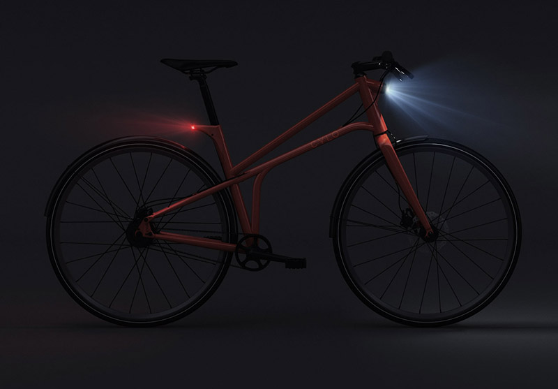
- Incredibly well built integrated front and rear light by Supernova model E3 Pure
- Reflective rims for better side visibility at night
- Carbon belt drive for silent and clean operation
- Internal gear hubs for durability and ease of use
- Fenders to keep you dry
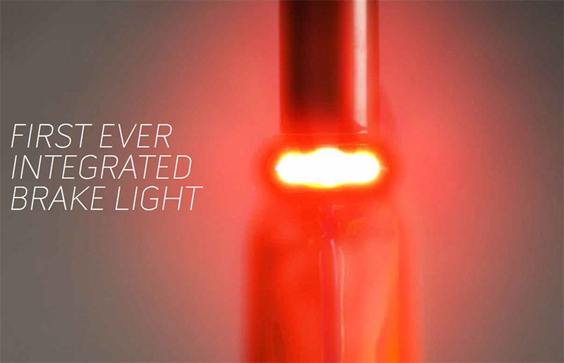
Eric points out that they are still developing the brake light as they are very picky about how it should work and don’t want to release a feature until they feel 100% confident about. “The complexity of making it work from a dynamo hub is much harder compared to a battery operated one, but it also works within our belief that everything should be integrated and work, always. No batteries, no attaching things every time you need ride. At this moment, we are meeting with factories and further working on the electrical engineering to ensure reliable use over time and true value add for our riders’ safety. We hope to be able to deliver it with CYLO1 but it might come as an add on at a later date.”
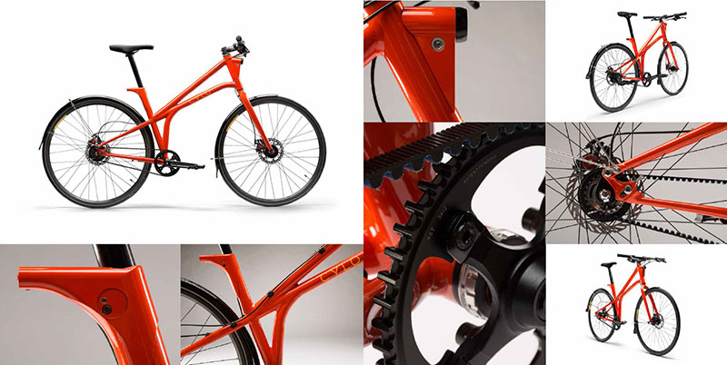
So there you have it, a peek into the design process from initial concept sketches to pre-production prototypes, all leading to the final design which is currently available for pre-sale on the Cylo website. A few additional images can be seen below, but check out the Cylo site, as well as their Facebook and Twitter pages for more.
One more thing…for readers of this blog, CYLO has graciously offered a $350 discount on any bike you purchase. Just use the offer code CYLOBikeDesign14 at checkout. In addition you can enter to win a CYLO1 bike in 8 speed in the color of your choice by simply liking their Facebook page.



Leave a Reply