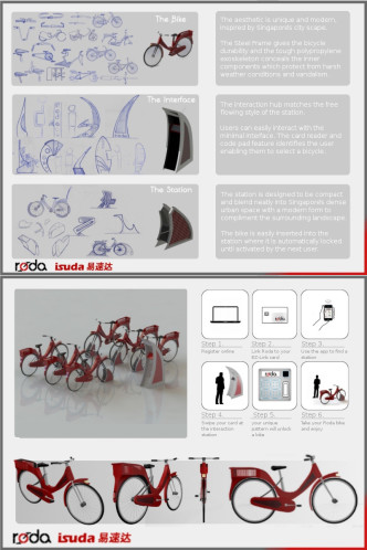
Voting ended in the online poll to select the reader’s choice winner of the Bicycle Design/ ISUDA bike share design competition, and the Roda design by Steve O’Neill, Niall O’Loughlin, Robert McKenna, and Mark McGuinness took the top spot with 31% of the votes. I suspect that the Roda team had an organized local voting campaign underway because they started slow, but quickly shot ahead in the poll the first week and stayed out front for the reminder of the voting period. That is the nature of online voting though, so congrats to team Roda on the win (though I am not sure how the four of them are going to share that Q-bike).
The reader’s choice winning Roda design was not one of the jury’s top picks, but I can share comments from three of the jurors about it.
Mark Sanders
The cheap steel frame as an insert into a PP moulding is an intriguing idea, and if it could be done would make for a self coloured and abuse resistant rental bike – some good sketches too, especially simple ‘S’ dock at centre of docking station sketch selection. But again, although functional, the bicycle design is pretty mediocre – kinda retro.
Yap Fook Fah
Nice but conventional design. No detail on how bike is locked to the station (at the dropouts?).
James Thomas
I am not really a fan of the aesthetics of the bike or the station (which is not mobile). I do like the simple frame construction on the bike and parts of the system interface though (the Smartphone app and the user set pattern to unlock a bike).

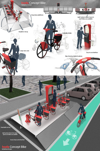
In addition to the reader’s choice winner, Francis from ISUDA is providing a second Q-bike prize for the jury’s top choice. Before the online voting started, Francis Chu, Mark Sanders, Yap Fook Fah, and I discussed the entries and ranked our top picks. The Isuda Concept Bike by Matthew Boobyer, which happened to finish 2nd in the reader poll, was the clear winner by the jury vote. Below, you can read the comments from each juror about Matthew’s design.
Francis Chu
A well thought through bicycle and station design. Umbrella holder is a nice touch. On the down side, the mobile platform seems to be too large. It also takes up a large space when it is “unfolded”.
Mark Sanders
The portable docking station makes sense as avoids the time consuming work of loading bikes on and off trucks to move them back to where needed, which I believe is an inefficient part of current schemes . The bicycle design is pretty mediocre.
Yap Fook Fah
Clean bike design with nice features – mudguards, integrated basket and map display. Portable docking design concept is nice, but I’m not too sure if the high platform could be a problem. Getting the bike down and rolling it down backward could be a challenge for some users.
James Thomas
Best solution to the mobile station issue. The live map to show where stations (and maybe bikes) are located is a good idea, as is the light indicator to show availability. I don’t particularly love the bikes, but the interactive maps, integrated lights, and ample storage are all nice features. I do have a concern about the safety of a steep metal ramp to roll the bikes up and down. The potential for slipping and falling would need to be addressed in the design.
That covers the jury comments for the two entries that will be awarded prizes, but I can share our feedback about the other designs in a separate post if there is any interest. It was a fun to review the entries, and though we didn’t get as many as we hoped, the competition did lead to some interesting discussion on the topic of optimizing a bike share program to use mobile stations. The Core77 blog, Atlantic Cities, and Treehugger were just a few of the sites to share opinions about the entries. We definitely appreciate their input, and the comments from all of you as well.
…and of course, a big thanks to all of you who took the time to design and submit an entry. Participation from readers is what makes this blog fun, so I definitely appreciate the interaction.

Leave a Reply