I have been amazed and delighted to see the traffic to Bicycle Design increase over the years…especially in the last year or so. The fact that more and more people are reading is great, but with only a few hours each week to spend on this blog, it has become much more difficult for me to keep up with the volume of email that I receive each day. My favorite messages are the ones directly from designers with a project to share, like the postal bike by Luke Guttery that I posted last week. Unfortunately though, a few good reader submitted projects have been lost in the shuffle recently, as I quickly scan my inbox and try to weed out all of the off-topic messages and requests (seriously PR people, I am never going to post about NFL merchandise or scrapbooking accessories, so keep the messages related to innovative bike stuff if you don’t want to be blocked).
If you are a designer with an interesting project that you would like for me to post, I want to share a few tips to increase the likelihood that your project will be shared here. First, make sure that you include the word SUBMISSION in the subject of your email. I look for those messages first, because I know that they are coming directly from readers. Second, do your best to make your design easy for me to post. Often I receive messages from designers that contain links to their work with no further explanation. Sometimes I have time to follow links and learn about the project, but other times I just flag those messages, then get busy with my own design projects and never get back to them. If you provide a 200 to 400 word description of your project in the email, it is much easier for me to quickly understand your idea so that I can easily share it in a post. I usually like to quote the designer when I post a concept too, so take a little time to explain the idea behind the design in your own words. Finally, I appreciate it when people size images that they send for the web. I usually resize images that I post to around 800 pixels wide, so there is no need to send extremely large files. That goes back to the same theme I mentioned before…making it easy for me will greatly increase the chance that I can share your work. I am not able to post everything that I receive, but I do appreciate all the submissions from designers, and the links and tips shared by all readers.
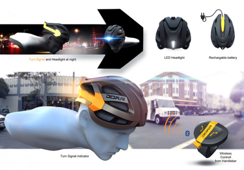
 I don’t want to post without sharing a design concept, so here is link to the DORA helmet concept by Balázs Filczer. As the post explains, the helmet features front and read integrated lights and turn signals on each side that work in “tandem with adaptable Bluetooth handlebar controls to give surrounding vehicles notice of the rider’s intent to turn or brake with universally recognizable light signals and colors.” It seems like a great idea to me. See an animated video and many more rendered images at YankoDesign.

Leave a Reply