Go Fara: a student project by Adam Taylor

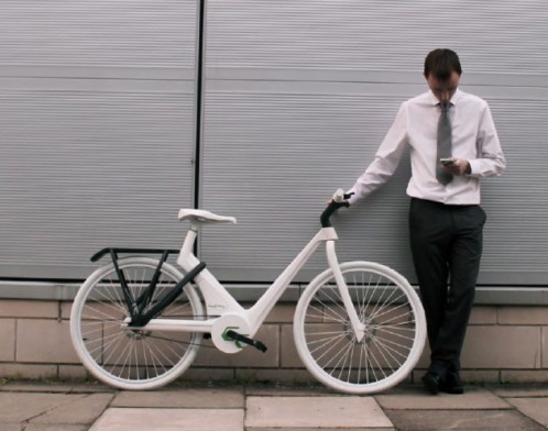
Adam Taylor is an industrial designer in England who is working toward finishing his MA in Future Design. His final project is a new commuter bicycle aimed at changing the everyday commute and working day of typical 9 to 5 office staff. The system consists of the Go Fara service and the bike “Tim”, which he envisions working together to encourage a healthy lifestyle for employees within a company. Adam can explain his concept better than I can, so following is a description in his own words:

The Go Fara system and bicycle has been designed to motivate commuters all over the world to reduce their carbon footprint and improve personal health.
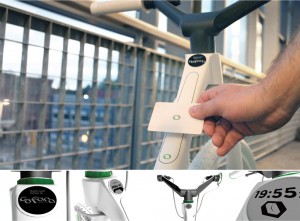
Over 75% of people live within 30 minutes of work and only 24% commute via bicycle. Motivation here is a key problem. Keeping active in a typical 9-5 job is tough; finding the time to exercise is a problem when a person has a variety of other commitments. Go Fara aims to solve these problems through a dual function product.

The Go Fara system is targeting major corporations to buy the product in batches. From here they can encourage employees to hire these bicycles for free, to commute back and forth from work. Through a self powered smart card system the employers know who is reducing their carbon footprint and can reward these individuals through a “Green employee of the week” system. This shows a concern to the environment and employees health, all the while building the companies green ethos. In addition employees can share their commutes with friends and colleagues and compete through a social medium.
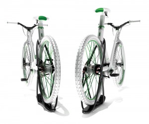
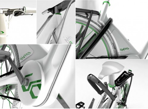
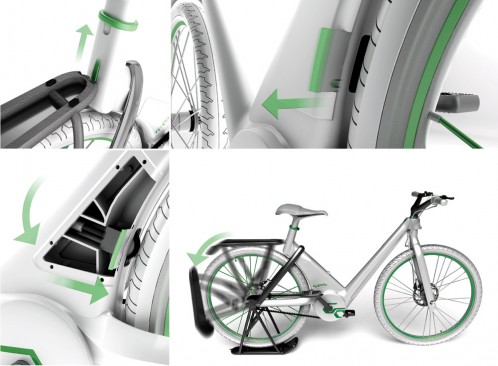
For some employees commuting by bicycle is out of the question, but through the bicycle we call “Tim’s” dual functionality it transforms into an exercise bike through 5 simple steps. The carbon fibre storage unlocks and rotates elevating the rear wheel; a roller system from inside the frame is released applying resistance to give the feel of riding on a normal road.

 The company can now allow 20 minutes a day for their employee to have a break and become refreshed through a moderate intensity workout, in or outdoors.

 The onboard computer is completely self powered via an internal dynamo hub, which powers the OLED front light, the E-ink display, smart card system and also the general cyclometer.
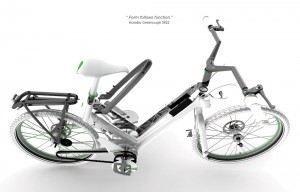
 A complete poly carbonate frame provides adequate strength and durability needed to provide a lightweight and affordable frame. The product is fully sustainable and adjustable to suit sizes from the 5th to 95th percentile.

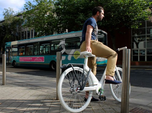
 Tim can be manufactured at an affordable cost and also recycled with ease once its lifetime is over, giving it a high green rating. The organic shape shows fluidity to attract attention and make users want to try the system, enabling more commuters to become healthy through green design.

Comments

12 responses to “Go Fara: a student project by Adam Taylor”

  1. Nina Kiumarsi Avatar

    This is a fantastic idea design. Well done Adam Tylor, you did a great job.

  2. Quentin Avatar
    Quentin

    I think he should re-think that forward leaning seatpost if he really wants to accommodate a wide range of heights. As a rider who is around the 90-95th percentile for height, I think I would end up in a time trial position when the seat is raised to its maximum height.

    1. Rob Avatar
      Rob

      That’s the way I see it also.

    2. art Avatar
      art

      This is way beyond time trial position. Even in the first picture, with the seat post just about all the way down, this bike wouldn’t pass the UCI saddle setback requirement. A tall rider is going to be hanging out over the front wheel pounding his knees into the bars.

  3. Michael Hall Avatar
    Michael Hall

    Well done Adam. It has been fantastic to see this project develop here at Teesside University in the Future Design studio and our 3D Design workshop. It seems very well timed and very well named in this year of Bradley Wiggins, Chris Hoy, Mo Farah et al. Very clever and innovative.

  4. Impossibly Stupid Avatar

    Color me less than enthusiastic. There is not enough of a base in exercise bike mode to keep it from tipping over, nor do I think that tiny wheel is going to offer serious resistance (neither do I want to carry the extra weight around with me when I’m, you know, using a bike as a bike!). Even a cursory look at existing bike trainers should have clued the designer in.

    Add in the custom build and extra electronics and you’re looking at a $2000 bike. You’re not going to gain any converts with those economics. A corporation would be better off giving away standard bikes that cost a fraction as much and making otherwise-boring-but-effective policy changes that reward cycling employees.

    1. Peachy Avatar
      Peachy

      I have to agree with you. The outcome is meaningfull but I struggle with the Gofara concept. I see it as a vastly expensive solution to one that could be solved simply by encouraging employees to purchase their own bicycle and rewarding its use. Im sorry to say that its verging on ‘Gimmicky’.

  5. John John John Avatar
    John John John

    Intriguin concept. I hear people complain about office work a lot so this looks like it would do the trick. Very innovative and impressive visualisation also. I do want to feel what its like to ride and test the strucutre. But a very original idea with good potential for development! Good work

  6. pierre Avatar
    pierre

    Sorry to be so negative, but I really don’t share the enthusiasm of some about this project. Firstly, it is a totally unappealing design with serious flaws, secondly, I really don’t see the point of wasting energy by pedaling indoors… Do you think that it is best that cyclists exercise indoors so that the streets stay empty to allow cars to drive faster? The future of cycling is in the streets and on the roads definitely not indoors. And if some are too scared by unsafe roads to ride on them, them the solution is to act so that the roads become safer for cyclists, not to add useless indoor stands. You point out that many employees say they don’t have enough free time to make a longer commute by bike, but yet you imply that their company would allow them spare time to exercise indoors… this doesn’t make sense. Commuting has to become the exercising time, as to save energy and time.
    Also as pointed out all the useless electronics ( compete with your colleagues when commuting, is this a joke?) would make this bike unaffordable.

    So why not work instead for instance on designing bikes that propose new safety devices rather than waste you time on a useless project like this one?

  7. […] | Bicycle Design Tweet !function(d,s,id){var […]

  8. Lewis Avatar
    Lewis

    Carbon-fibre is a totally unsuitable material from which to construct the rear rack/trainer stand because scuffs and scratches expose the fibres underneath the gelcoat and seriously weaken it. Both racks/carriers and trainer stands suffer from this kind of damage due to luggage, bungee-cords, leaning on walls, being dragged along the floor etc. It’s also brittle (it fails suddenly), which is the least desirable attribute for a training stand! Some forms of polycarbonate are scratch-resistant and fail slowly and progressively – why not use this?

    There’s absolutely no way that a roller small enough to fit inside the frame will provide enough resistance to function as an exercise bike. Rollers also get extremely hot (and the smaller they are, the hotter they get) which could distort or damage the polycarbonate frame. All trainers are famous for destroying tyres!

    I’m also unconvinced about the polycarbonate frame. I’m sure it’d be rigid and durable enough, but not more so than a steel or aluminium frame. It’s also susceptible to environmental stress failure – which increases if the polycarbonate is recycled. The chance of cracking is massively increased at the V-shaped intersection between the downtube and seattube – it acts as a stress-raiser, and needs a larger radius. The headtube is also tiny – this probably makes it quite flexible – it’ll squirm under heavy braking. Perhaps a composite structure of rigid/brittle polycarbonate bonded to an exterior shell of durable and scratch-resistant polycarbonate would be a better frame construction?

    The forward-leaning seattube is unforgiveable in terms of ergonomics. It’ll make the bike unrideable for anyone with long legs. And although it’s only a small detail, the angle of the brake levers is wrong – they should be in line with your forearms when sitting on the bike, otherwise they’ll be very uncomfortable to use. Also, there are no mudguards – making the bike quite unrideable in winter (or summer too, as it happens).

    Aesthetically I think it’s a bit clumsy (reminiscent, perhaps unintentionally, of that other famous plastic bicycle), and it also reminds me of a ghost-bike (which is not uncommon in student design studies).

    I like the concept of integrating social media into cycling, but Strava already does this – and without the need to buy a new bicycle. Overall I think there’s a lack of research and thoroughness.

  9. Josh Avatar

    Adam,

    Please contact Bike and Park, we would love to talk to you about your project. Thx.

Leave a Reply

Your email address will not be published. Required fields are marked *