 I was on vacation at the beach with my family last week, and took a break from this blog (and the internet as a whole). I have some catching up to do, and a lot of bike design content to sort though and share, but I’ll start with a very quick post today.
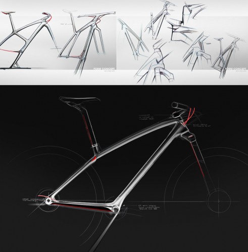
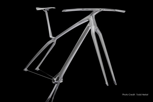
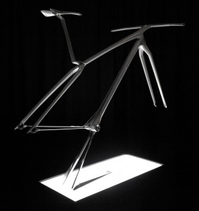 Michael Hammond is the lead industrial designer for Trek Mountain Bikes. Recently he posted an interesting Trek Visual Brand Language Sculpture on his Behance page. He points out that “Trek reinvented its mountain bike line in 2008 with technological leaps and bold new styling, so it was time for a refresh going into 2013. This is the form concept for the Trek brand visual language; an emphasis on light/technical/agile.”
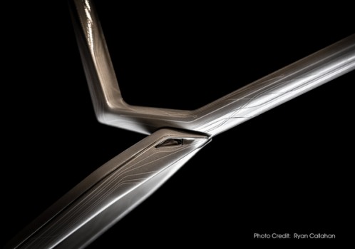
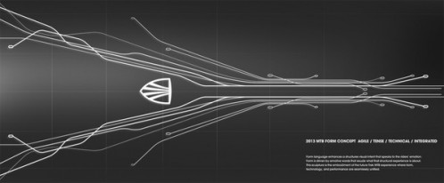
You can see a few additional images of the form concept below, but be sure to click over to Michael’s project page for several more images and additional information about the project.

Leave a Reply