Bicycle Design Competition follow-up

OK, we are nearly halfway into 2012, and I still haven’t started working on the new design competition that I mentioned late last year. I still need to decide on the details and find a company to provide a prize for the winner, but it is going to happen (once I can find a little free time). There are some great topic ideas that have been suggested by readers, and you still have time to leave additional comments with ideas for the contest.  As some have suggested, I am going to let you all decide the winner of this next competition. I will still assemble a jury to narrow down the entries to 10 or so finalists, but from there, the winner will be decided based on your votes.

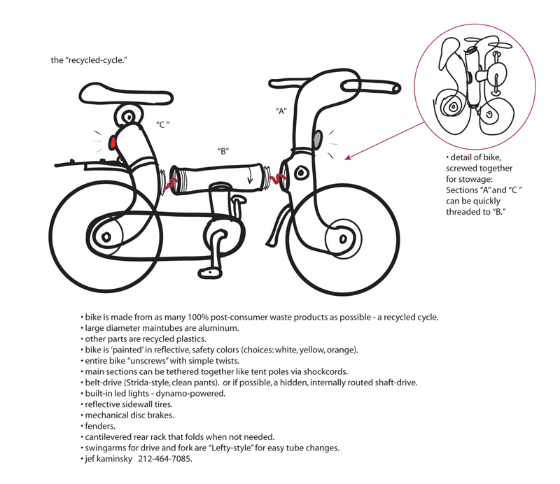
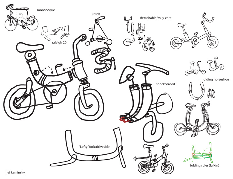
After the finalists and winner were announced in the first Bicycle Design competition in 2008/2009, I posted quite a few of the other entries. I didn’t post them all though, so I want to go back and share a few more of those old entries today. For the first two, the designers’ text from the entry is included to describe the concept. The third concept, by Jeff Kaminsky, has all of the text included in his image boards.

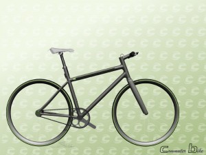
Ryan Lee’s commuter bike

The images created for this concept were to show ideas for refinement and development rather than styling. I commute to and from work on my bike and found the following issues a concern:

-Juggling the lock, and the bike, and the cable when I arrive/leave the bike rack

-Having the lock wrapped around my bars/frame/etc.

-Having add on lights that are not integrated, need battery changes and can be easily stolen

-Oiling the chain after days of rain, and the chance of getting oil on my clothes

-Increasing the potential of theft by having the fancier looking bike in the rack
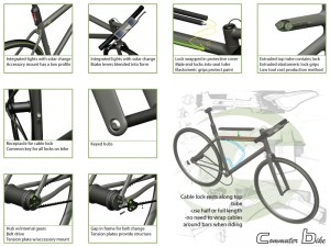
The concept ideas address these, and are feasible enough that developing and refining them do not seem a stretch of the imagination. An inconspicuous diamond frame lets the bike blend in with others. A cable lock resides in an extruded top tube profile (low tooling costs). This cable lock is held in place by an elastomeric extrusion and female receptacle. A second, locking female receptacle is on the seat tube. The key for this lock is the same as the locks on the hubs.  Integrated, solar powered lights reduce accessory theft. A belt driving a hub with internal gears reduces maintenance concerns.


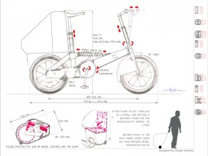
Cengiz Ekmekci’s Logic Bike

Some of the design goals of this project includes:

-provide unique qualities that would attract not only current bike users’ attention but also non-biker’s as well.

-user friendliness with easy maintenance

-adjustability for all sizes of people.

-5 speed (in the hub), automatic control*
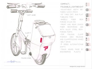
-The bike requires 1 compact Li-on battery, which is located in the Frt. Frame. Electric charge for the battery is provided by in frt. Hub generator.

– It is fair to say that popular 24, 18 speed manual systems in the market are not being used with a clear understanding.  In that sense, automatic system can re-revolutionize the way the bikes are conceived.

*Detailed info on automatic control system is not provided (due to the fact that it is not registered for a pattern yet).  5-speed manual system can be considered as optional as well.


Jeff Kaminsky’s recycled Cycle

Comments

12 responses to “Bicycle Design Competition follow-up”

  1. Andy Avatar
    Andy

    The “commuter bike” on top is one of the best designs I’ve seen on this blog in a while. It uses feasible-to-produce parts that wouldn’t cost several grand like most CAD porn bikes. The designs actually improve the function of a commuter bike, rather than just act as “design features” that are added for a unique image even if they are completely useless. I normally cringe at solar charging systems, but that’s because most claim they will power your phone or charge a laptop which is totally unfeasible from such a small solar panel – but to power some small LED see-me lights for urban riding under street lights, a bike left outside in the sun might actually charge enough in a day for that. I’d rather see the solar system on a separate but firmly mounted part, so that users could swap brake levers when needed (since many commuter style bikes come with low level parts to keep the costs down, and assume anyone that wants better parts will simply swap them out).

  2. Peter Johnson Avatar
    Peter Johnson

    Both the commuter bike and the logic bike had more merit to a commuter type bike than the actual winner. The commuter bike from Ryan was elegant in function and the logic bike had a simplicity that was attractive. I am glad the public will vote this time!
    Peter

    1. James Thomas Avatar

      Peter, I like Ryan’s bike too, and a simple bike like that does appeal to me personally (my current commuter is an old Litespeed road bike). The goal of the last competition though was to design a bike that would appeal to people who do not currently ride a bike for whatever reason. That is a tough, and somewhat vague, challenge, but that parameter definitely steered the judges’ decisions. I agree though that it will be interesting to see how readers decide on a winner in the next competition. I’m looking forward to it.

      1. Andy Avatar
        Andy

        Which is why a main tenant of the next competition should be a producible bicycle. The ThisWay doesn’t seem to have a single feature which has inspired an actual design concept that has been used on new bikes. A quick search shows nothing new came of that design after 2009. They made some CAD porn, won a bike out of it, and poof – never mentioned again. What I assume the point of the competition was, was to create a bicycle design that would inspire bike builders to consider some of the design aspects that could be used to entice new riders. That aspect seems to have totally flopped, because the winning design is highly improbable to produce for a price that a new rider would find reasonable.

        A better design competition would be one that aims to entice ideas that are actually producible, affordable, and likely to be used in the very near future. Ryan Lee should simply reapply with this design if that was the competition. This design has many features that are actually feasible, actually improve upon commuter bike designs in certain ways, and aren’t likely to double to cost of a bike to implement those features.

        1. Nick F Avatar

          I don’t think that’s necessarily true – ThisWay is an inspiring attempt at a complete, somewhat practical HPV.

          When I saw it as a design student, I was motivated by its vision (and of course, its flaws) when I was designing concept commuter bikes myself.

          I now work as a bicycle designer… and while I haven’t implemented any ThisWay-esque features in production bikes, I certainly am always striving to design total transportation solutions that are accessible and exciting.

          (And of course, I also think Ryan Lee’s designs are great. They are simply two very different scopes of design – one is about adding new features to existing bicycles, and the other is about making bicycles an entirely new form of transportation. Both a valuable)

          1. Andy Avatar
            Andy

            Without going into too much detail about the ThisWay, it’s just a solution in need of a problem. It would weigh at least 40lbs, it can’t be carried easily, can’t be used with bike racks on buses, it would likely cost $3000 or more, it uses lots of specialty parts, and the selling points like a narrow windshield are just price enhancers that don’t offer a real benefit. In essence, it’s just a designers project and an experiment with CAD, but has no feasibility as a bike that a new rider would ever consider.

            I’d struggle to call that “valuable.” I can certainly appreciate the design, but clearly there is a reason why nothing more has happened with that design or any of it’s features since 2009.

            1. Nick F Avatar

              It’s halfway between a bike and a velomobile. Clearly, the market isn’t huge for velomobiles – but there are plenty that are much more complex than ThisWay – and have made it to market nonetheless. Moreover, I think it’s safe to say that the people who ride velomobiles DEFINITELY fit the criteria of “a bike that would appeal to people who do not currently ride a bike for whatever reason”

              To get specific – the Veloform pedicab is a very similar design to ThisWay, albeit in a much larger, multipassenger version:

              http://www.rikschataxi.ch/index.php/unternehmen.html

              It certainly has its own design flaws, but it is probably one of the most successful velomobiles to date.

        2. James Thomas Avatar

          Andy, I still think you are missing the point of the original “Commuter Bike for the Masses” competition. Perhaps it was destined to fail in your opinion based on the premise, but I would encourage you to re-read my original post, which served as a catalyst for the design competition. The scope of the design brief was pretty large (and perhaps a bit unrealistic), so slight design improvements to bikes that you or I might use for commuting just didn’t seem to address the question of how to get the “blue ocean” of non-cyclists to consider traveling under their own power.

          As I stated in that original post, I was throwing out a lot of questions that I didn’t really have the answer to. The goal of the competition was really to generate more discussion on the subject…and that it definitely did.

          1. Andy Avatar
            Andy

            Apparently I am completely missing the point. When a commuter bike that wins a competition is expensive if it ever were produced, unlikely to ever be produced, and offers design features that offer no real benefit (tiny windshield) with much detriment (add 10 pounds), I am left scratching my head as to why a new cyclist would perceive that as something better than the $300 hybrid they can actually go into a store and buy today.

            Ryan’s bike design tackles several of the common new rider concerns – like how to lock up a bike without having a bulky U-lock dangling from the handlebars, how to stay visible at dusk without having to charge up batteries everyday for their lights, and attempting to keep the drivetrain simple with IGH/belt.

            1. James Thomas Avatar

              Andy, I agree with the points you made about Ryan’s bike in your second paragraph…especially about the lock issue. His entry was actually one of my top 6 picks, but based on the ratings from the other jurors it barely missed being a finalist overall. We definitely had a hard time coming to a consensus in ranking the very different design approaches from the various entrants, but I still believe that the discussion that came out of it was pretty valuable.

              I am happy to hear that Nick was inspired by the competition as a design student, and I hope that others were as well. Whether you like the winning design or not (and yeah… I know that you don’t), I hope that you agree that an open forum about the small role that industrial design can play to get more people on bikes is a good thing.

  3. Andy Avatar
    Andy

    It would be interesting to find data related to this, but I doubt that most velomobile owners went for that first before riding bicycles for a while. “Made it to the market” is also quite a stretch. From what I gather, a few dozen are sold in the US each year by a few brands. Prices I found were around $10,000 for a full velomobile. For someone looking for an alternative to cars, a velomobile is a great option, but either someone is fully onboard from the get-go otherwise it’s going to be a huge struggle to convince the typical person to drop more money on a bike than a car.

  4. Ed Avatar
    Ed

    James was given a pretty hard time after the last competition but to be fair he handled the criticism with great dignity. It’s time to move on.

    I totally understand the points Andy is making because passion for cycling drives us to concentrate on improving existing machines rather that worry about getting the ‘great unwashed’ to start up cycling.

    The competition criteria was misinterpreted but I believe James now realises that his readership wants a competition that suits their passion and not the more oblique ‘blue sky thinking’ that was the previous theme.

Leave a Reply

Your email address will not be published. Required fields are marked *