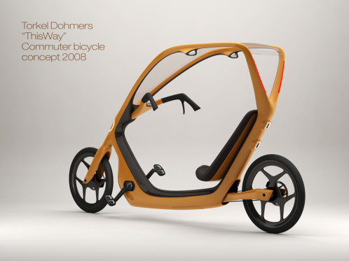
We have a winner!

Torkel Dohmers "ThisWay" covered bicycle designIt has taken some time, but I can finally announce that Torkel Dohmers’ “ThisWay” concept has been chosen as the winning entry in the Bicycle Design “commuter bike for the masses” design competition. Congratulations to Torkel, who will receive a Cannondale Bad Boy 700 for his efforts. Since I already published Torkel’s description of his entry, I won’t post it again, but you can read it in the finalists post if you are interested.

Some of you may be wondering why it took so long to announce the finalists and then to announce the competition winner. Well, it wasn’t an easy decision. As you know, a jury of designers, and one journalist, with varied backgrounds made the selection, so you can probably imagine that we had different opinions about the various entries. Those differences led to some really great discussions as we worked to reach a decision, so I want to share a little bit of that with you.

First, let me back up a bit. In order to decide on the finalists, each juror made a list of their top ten picks in order of preference. From those lists, I assigned points to each pick (10 points for first, down to 1 point for tenth). I compiled the points for each entry that we chose, and the six finalists were decided based on those numbers. As we made those initial lists, we each wrote a short comment about each of our picks. Here are a few of those initial comments about Torkel’s “ThisWay” concept.
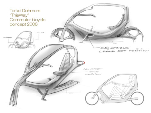
Torkel Dohmers "ThisWay" sketch“This semi-enclosed design is different and attractive to be a clean, mould-breaking alternative to non-cyclists. The frame is light (and potentially low cost in volume) due to tall frame (high 2nd moment of area), and offers more protection from other road users, weather and can be seen. My only hesitation is the semi-recumbent riding position, which may put off previously infrequent riders.”

“Fresh concept, well executed design, weather + crash protection make it appealing to non-cyclists. By far the best proposal in my opinion. I’d move the seat up a bit higher for improved safety in heavy traffic though.”

“This one is my favorite concept by a long shot. I have seen attempts at a bicycle frame with a partial roof before, but they all look clumsy and top heavy. In this case though, the overall form looks integrated and visually works well. The semi-recumbent riding position is not all that different than the position of a driver in a car, so it may appeal to non-cyclists. I think the seat could be a bit higher to allow a ride similar to a Townie or one of the other popular “foot forward” upright bikes that are popular today. The presentation board could have done a better job explaining the modular cargo attachment on the rear of the frame, but overall I think this concept address the car replacement issue best of all.”

“Personally I’ve never tried a recumbent – I’m very comfortable on a regular bike, but a recumbent makes me think I would have to learn to bike all over again, (would love to try one though!). I can imagine that they are fairly stable as your c.o.g. is lower, but since you are sitting low you are not visible in the traffic. I’m imagining a recumbent could be a bigger obstacle for a non-biker to overcome than to get on a regular bike, especially when thinking about different age groups – it’s an issue with familiarity and perception. What I do like though is that it has the playful outline / x-section of a car indicating that it is a step closer to a car than a regular bike. Overall a very nice design. Like that it has a roof – but I guess it never rains sideways where he lives…”
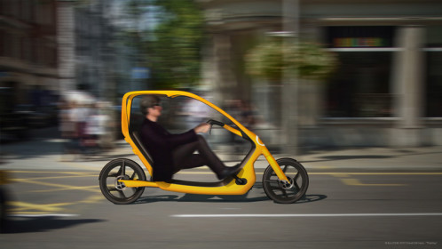
Torkel Dohmers "ThisWay" enclosed recumbent designSo based on the numbers, “ThisWay” easily made the list of finalists, but that was just step one. We still had to agree on a winner, and that is when the real jury discussion started. As you can see from the comments above, a few of the jurors liked the concept, but had some reservations about the recumbent riding position right off the bat. As we discussed the six finalists, a couple of jurors still had reservations about Torkel’s concept:

“My main concern is that a recumbent would be a bigger obstacle for a non-biker to overcome than to get on a regular bike, especially when thinking about different age groups – it’s an issue with familiarity and perception. I think a regular person would feel that they would have to learn to bike all over again – therefore they would stick to what they are familiar with, their car.

To me this would appeal to a bike-enthusiast for which there are plenty of bikes already on the market – so it is not inclusive. A non-biker is, for example, a mom with a busy schedule and several kids, an high-up executive with status issues and a really expensive car he / she loves to show off, a person with back and neck-problems, an older person afraid of falling, an obese person who considers walking their main form for exercise, etc etc.

A non-biker, who is new to recumbents, would probably not feel safe in heavy traffic as you will sit considerably lower than on a regular bike.”

A few responses to the rider position concerns were:

“To recommend a higher riding position, ie ‘foot forward’ rather than recumbent, not a sporty position but nearer classic urban Dutchbikes, than it is now.”

“A (slight) foot forward geometry is amazingly comfortable, for most people. It also feels efficient (except for maybe ‘racers’).”

“I don’t think a feet first semi-recumbent position is necessarily bad, but the seat could move up a bit. Maybe it could fall somewhere between what is shown in the rendering and something like and Electra Townie.”

Another concern about this concept was the potential cost/ commercial viability, to which one juror responded:

“I think with decent production engineering (possibly using frame making techniques from Toy, Boat, or sport equipment makers rather than bike frame makers) …. it could be made to sell under $1000 to start and under $500 if volume took off.”

“From an engineering point of view the ‘frame’ can potentially be pretty light for its size. This is because the materials are basically in the right places to maximize stiffness, without being a fully enclosed ‘eggshell’ (it has a large 2nd moment of area). I could imagine this being molded in glass fiber, around hollow tubes, or even blow or roto-molded ! So cost and weight need not be ‘show stoppers’.

In addition to questions about rider position, the jury pointed out other issues that could be addressed with future development; shielding from road water spray, transmission routing, the possibility of electric assist, etc. Most of those points are minor details though. Overall, out of all the entries, “ThisWay” was the concept that most of us on the jury felt was “different enough to be a ‘paradigm shift’ from, and an alternative to, existing bikes.”

I could throw in many, many more quotes from the jury, but this post is already getting long. It is impossible to capture all the different thoughts, but I do hope that the short bits from our discussions help to give you an idea of the thought and back and forth discussion that went into the decision. I will close with one more quote from a jury member:

“I think we can all agree that convincing a non-biker to leave their car behind is a very complex and interesting problem to solve. There are so many levels to this that we probably haven’t even thought of, and it would take a lot of research / ethnographies to uncover all the different issues involved and to understand how to address them.”

I couldn’t agree more, so let’s keep the discussion going. After all, that is what this blog is all about.

Finally, before I close out this (long) post, I want to again thank the other jurors for the time and effort that they put into this competition. Thanks to:

Torgny Fjeldskaar- Director of Industrial Design & Advanced Products Division at Cannondale Bicycle Corporation

Mark Sanders- Principal of MAS Design Products Ltd and designer of the Strida and IF Bikes

Agnete Enga- Senior Industrial Designer, Smart Design/ Femme Den, NYC

Carlton Reid- Editor at BikeBiz, Quickrelease.tv, Bikeforall.net, and BiketoWorkBook.com


Comments

72 responses to “We have a winner!”

  1. GhostRider Avatar
    GhostRider

    Man, you got some real “heavy hitters” on the judging committee!

    James — great stuff! This competition sparked a lot of wonderful discussion. Although lots of us “regular” folks might not have agreed on the finalists, we all must admit that there were lots of useful tidbits in all the entries.

    Congratulations, Torkel!

  2. Anonymous Avatar
    Anonymous

    Congratulations to the designer and the judges.

  3. labikerides Avatar
    labikerides

    Congratulations! I want to echo some of GhostRider’s comments: As someone who bikes for my regular commute, I’m not enamored of the design for my own purposes, but I think it more than lives up to your original goals for the contest. So congratulations to everyone involved.

  4. canoelover Avatar
    canoelover

    This reminds me of a BMW scooter I saw in Italy several years ago…very cool.

  5. B. Nicholson Avatar
    B. Nicholson

    Look up in the sky!
    Is it a bird?
    Is it a plane?
    No, it’s a velobmobile!

  6. ian in hamburg Avatar
    ian in hamburg

    Canoelover said the same thing I was going to. BMW sells a low-power motorcycle of a nearly identical design. Because the driver sits in a protective shell, it’s the only motorcycle approved for riding on German roads without a helmet.
    It’s called the C1.
    http://en.wikipedia.org/wiki/BMW_C1

  7. Anonymous Avatar
    Anonymous

    Ian in Hamburg “nearly identical design” .. are you kidding ? !!! its TOTALLY different, the only similarity is that it has option of a roof.

    Congratulations to the winner – great design. I am a designer and I KNOW how difficult it is to make a new product look SO good.

  8. -Jim Avatar
    -Jim

    Very cool, Congratulations! Now, where do I put my laptop or groceries?

  9. Anonymous Avatar
    Anonymous

    Jim- there is a cargo attachment that snaps onto the back.

  10. Conor C Avatar
    Conor C

    Congratulations Torkel!

    It’s a good idea, elegantly realised and one that can be easily understood by non-cyclists, so should hopefully generate a wider discussion about commuting by bicycle.

    And fair play to James, you came up with a great idea to generate as much discussion as has been seen on your blog and also for picking such an interesting and qualified Jury. it would be great to find out more about what they had to say about the other designs.

    Hope you’ll manage to do this on an annual basis.

    Anyway, to celebrate, will there be champagne and how do we carry Torkel around on our shoulders?

  11. Conor C Avatar
    Conor C

    if I could just modify this line, it’s closer to what I intended:

    …you came up with a great idea to generate much discussion, as can been seen on your blog…

  12. GeekGuyAndy Avatar
    GeekGuyAndy

    Yea, it looks like a neat design, but there are some major cons.

    1. “Enclosing” a possibly 2 foot wide area won’t protect a ride from much. If there is a tiny bit of wind, you would still get soaked in rain. As mentioned above, anything from the road still hits the rider as well

    2. The windshield would likely be some type of plastic. I can just picture getting a few scratches and having to replace the whole windshield too often. If it were glass, then this bike would become much too top heavy.

    3. Speaking of weight, this design may work on flats, but I can’t imagine trying to convince commuters to even climb 50ft in a bike that probably weighs 50-60 pounds without being able to stand on the pedals. If you think it’s possible to build this design for less than 50 pounds, than you’re adding thousands onto the price tag.

    4. The drive train is hard to see from the pictures, but it seems like it is enclosed in the frame. The last thing a commuter who doesn’t know how to repair a bike wants is a chain to fall off, and if they can’t even see the chainring, this becomes a bike item to walk through town.

    5. It won’t fit on any typical bike rack, so all those great cities with racks on the buses won’t work with a bike like this.

    The best design, in my opinion, for a commuter bike is one that is as light as possible to still be strong enough for the riders weight, cost as little as possible, have easy to fix parts that don’t require $50 at the shop for a tune-up, and can make multi-modal commutes possible. Kudos to designers for making nice looking bikes, but functionality and price is what will reel in the potential commuters, not a fancy recumbent velomobile.

  13. Anonymous Avatar
    Anonymous

    Looks too much like a car. Booooo!

  14. Anonymous Avatar
    Anonymous

    As a designer and engineer I can appreciate what a great concept this is. In fact, when I first saw this in the list of finalists it looked like the winner to me. The roof will need to be wider and like a fairing in front of the legs would help keep reduce splash from the road, but this is a great design to build on.

  15. JW Avatar
    JW

    Who is going to build it? I would challenge the designers and production parts of our industry to make it happen if only in concept. I haven’t seen a radical departure from the double diamond design ever receive a passing thought from the industry; sure its not a “bike” but it is pedaled and has two wheels. If you make one I’ll ride it for a year in Seattle as a test!

  16. Anonymous Avatar
    Anonymous

    Dear Lord.

  17. Ron Avatar
    Ron

    Practical? Here’s my analysis of this bike.

    Congratulations to the winner, Mr. Torket.

  18. Jim G Avatar
    Jim G

    That design is pure BULLSH*T. A commuter bike — yet there’s no fenders, lights, or provisions for carrying any sort of cargo? How practical and useful is that!?!

    On top of that, the design looks like a Giant Revive with a roof — and how well did THOSE sell!?!

  19. BIkingBis Avatar
    BIkingBis

    I particularly like the “roof” on the winning bike… Maybe he should make it slide back in the summer as a “sun roof.” Very cool contest, James.

  20. Anonymous Avatar
    Anonymous

    Crap design. Next concept please…

  21. Rick Avatar
    Rick

    Excuse me, but how is this supposed to provide any crash safety?

  22. James Avatar
    James

    It is interesting to see the comments here so far. They are mixed, just as I expected. As I have said before, discussion is what this is all about, so I do appreciate comments like the one from GeekGuyAndy, who goes into detail about his concerns regarding this design (some of which we discussed as well). I don’t expect everyone to agree with the winner, and that is fine. As I said in the post, we didn’t all agree as a jury. All I ask is that if you have a negative comment, try to back it up with some real constructive criticism.

    One person took the time to email me privately to let me know that we (as a jury) made “the wrong choice”. Actually, it was pretty funny, because he explained at length that he has bike commuted for 15+ years and therefore knows exactly what a bike commuter wants and needs. Based on his experience, all anyone needs is a sturdy steel bike with lights, fenders, racks, etc. The response that I sent to him is relevant to some of the other comments that have been left, so in the interest of general laziness on a Friday afternoon, I will share it again here:

    “I am glad that you have been commuting by bike for so long. I have been bike commuting since the early nineties as well, so I am sure that I know a few of the same tricks that you mention…but maybe that is part of the problem. If you go back and read the design brief and the post that prompted it, you will learn that I commute on a fairly standard road bike- great for me, but not ideal for people who are not already “into cycling.” The point of this competition was to think about those people who don’t really care about bicycles and don’t have a preconceived notion of what makes one bike better than any other.

    Many of the people who work in the bike industry are in those positions because they are really passionate about bicycles. They absolutely love cycling, and that is great, but it also means that sometimes they have a hard time looking at the product line that they offer from the point of view of an average person. A person who is apathetic about cycling is not going to be drawn to the same features as someone who is interested in cycling enough to read magazines or blogs on the subject. So how do bike companies reach those people? The idea behind the competition was to get people thinking along those lines. The bike industry doesn’t have to stop making cool new products geared toward enthusiasts (and I would be really upset if they did). What they do need to think about is reaching the people who currently have no interest in the products that they already make. I didn’t expect to come up with all the answers, but with this competition I wanted to start a discussion along those lines. I think that is a happening and I am pretty happy to see it.”

    OK, enough from me- back to comments from all of you. Have a great weekend everyone, and keep the thoughts coming.

  23. gsport george Avatar
    gsport george

    I like the design, and obviously for the time and space available to explain it it is fine. But it obviously would need a huge amount more work to make it even close to viable.

    1. Although the shape allows for a large second moment of area in purely mathematical terms, you cant think of two (or three) such widely spaced members as a single structural element with a single second moment of area, it needs to be considered as a dynamic structure and as soon as you do that you see that all the load is applied to and reacted at the lower member, and that the stiffness of the upper members is unlikely to be sufficient for them to contribute much other than to their own task of holding up the roof.

    2. If this is a bike for “the masses” then perhaps it is important to think where “the masses”, who predominantly live in high density urban areas with VERY limited space, are going to store (and park when at their destination) a 6 foot long 4 foot high 18inch wide behemouth like this…

    In terms of the transmission, structure, weight and price; god is in the details, and this needs a huge amount of really good detailed design to make it “work”..

    George

  24. Anonymous Avatar
    Anonymous

    Well Said James !!!!!!!!!!!!!!!

    Brilliant competition, worthy winner and excellent discussion.
    Your comments above bring it right back on target, I guess some commenter’s have just not read the brief or are already hardened enthusiasts.

    Like others, at some stage I’d like to see all the entries and hear more comments about them, shortlisted and non-shortlisted.

  25. Robb Sutton (198) Avatar
    Robb Sutton (198)

    Great pick James! Like any radical design…there are going to be people that love or hate it. You got in some incredible designs so I am sure it was really hard to choose…but every contest has to have a winner!

    Great contest and a worthy winner.

    -198

  26. Anonymous Avatar
    Anonymous

    Today is day one. Lets see if this bike gets to the masses!

  27. Rodney Avatar
    Rodney

    I highly doubt that.

    Not to be a party pooper but given the amazing simplicity of what we already have today, I feel this large bike presented here isn’t really ideal for urban and rural riding scenarios. But given the jury’s decision of choosing one from many, it is very likely that this one turned out to be the “best”, according to them. That doesn’t really mean it’ll work.

  28. Mark Huang Avatar
    Mark Huang

    Congratulations Torkel!

    Thanks to James and the other Judges for their time.

  29. Anonymous Avatar
    Anonymous

    A bike design competition is problematic as unlike say, a computer concept design competition, the physical reality is so much more closer, bicycles are straightforward to comprehend. There is an unspoken demand for reality.

    As such, I really question the dynamics of this in real life. Concepts cited in this blog periodically get much more critical review.

    I place this in the category of the best presentation that shows well to the general public at first glance.

    If further editions of a bicycle design competition are being considered, the design brief should be answered more specifically, or why a requested attribute was dropped be included with the entry. Breaking the rules can have redemption, but the reasons should be stellar.

  30. Anonymous Avatar
    Anonymous

    Organizing any kind of subjective contest must be a real pain in the donkey. Kudos to James and congratulations to Torkel.

    The bias of an industry (bike, car, etc.) is toward design that does not threaten its current production. So the bias will diverge into the practical that mirrors current designs or the impractical that shows unrelated entertaining concepts. The contest finalists looked like common, currently available designs or complicated conceptual designs. And because of the makeup of the jury – mostly industrial designers – there was probably also a bias toward industrial design concepts versus engineering design concepts.

    So how well does the winning design meet the subjective criteria?

    5/20 for getting the average non-cyclist to consider riding a bike for transportation. Even though it has some comfort features, a non cyclist is going to look at this like it’s a flying saucer. Compare the Velib or SmartBike designs. Also, recumbents are not easy to ride for a non cyclist. Were there any non cyclist judges?

    10/15 for creative, new combinations of ideas. At heart it is a recumbent with a fairing. The solar power and integrated lights and integrated mirrors seem new to me.

    5/20 for sound concept – not just physically sound but also financially sound. Unless there are dramatic changes in the price of technology or the numbers of recumbent riders, it will be heavy and expensive. Also, the rider’s heels will hit the ground.

    10/15 for clear definition. It’s not clear how the steering mechanism or rear suspension (especially with a belt drive) works.

    0/0 for originality, i.e. not deliberately plagiarized. Nothing in bikes is original, it really has all been done before and probably about 100 years ago, too. The Cycle Sol bears some physical resemblence, but people can have parallel similar designs.

    10/15 for innovation – forward looking ideas. The safety and solar features are very forward looking, and the design itself is futuristic looking.

    15/15 for presentation i.e. slickness. They are nice graphics.

    55/100.

  31. TeDee Avatar
    TeDee

    Big thanks to the initiator of the design competition, the members of the jury for your engagement, all entrants for creative contributions, positive comments and last but not least, to all constructive criticism on this blog!

    I strongly believe this will all contribute in shaping future products and behaviour around cycling culture.

    Back to the saddle…

    T Dohmers

  32. Anonymous Avatar
    Anonymous

    Since GeekGuyAndy has done a very good deconstruction regarding the functionality of this winning design, I will simply point out the manufacturerable profitability of it.

    With about a 33% GP at each step from from Mfg, to Dist., to Shop, to Customer, the Unit Cost would need to be roughly under USD $300 FOB USA in order to sell it to a customer for under $1000 USD; and under $150 for the customer to get it at $500 USD.

    So, not only is this design not practical, effective, and could be debated as to its' safety; there is also not way to manufacture this product with the current materials, using the current manufacturing methods, while paying acceptable labor costs for any country on earth.

    Torgny, Mark, Agnete, & Carlton I am deeply disappointed in allowing a statement such as – “I think with decent production engineering (possibly using frame making techniques from Toy, Boat, or sport equipment makers rather than bike frame makers) …. it could be made to sell under $1000 to start and under $500 if volume took off.” could be stated in manner to validate this design when all of you should know very will this statement is absolutely bullshit.

    You all work in companies designing things inside realm of manufacturability with a clear general understanding of basic costs.

    – Ryan

  33. James Avatar
    James

    Ryan said, "Torgny, Mark, Agnete, & Carlton I am deeply disappointed in allowing a statement such as…"

    Huh? You are deeply disappointed in all of those people because of a statement that ONE person made in our discussion? That doesn't make much sense to me. The point of the different quotes was to illustrate the idea that we did not all agree and that there was a lot of back and forth. I won't say who made that statement, but I will say that it does not represent the views of everyone who participated on the jury.

  34. Anonymous Avatar
    Anonymous

    A basic aluminium MTB frame costs $20 to $50 to make in China. So what’s the problem ?

  35. James Avatar
    James

    I should have added in my previous comment that the person who made the statement that Ryan questioned has a LOT of real world experience producing bikes and other consumer products.

  36. Rick Avatar
    Rick

    Hi James,
    I enjoy your site–thanks!!
    Do you know of anyone who would build a Obree type bike for triathlon?

    Rick

  37. Brian Avatar
    Brian

    “I won’t say who made that statement, but I will say that it does not represent the views of everyone who participated on the jury.”

    James,

    I question the knowledge and judgments of the jury. Its hardly the time to criticize now since the winner already has his bike, but I think in future you need to put together a more versatile team of people, some within the realm of art, and some in the realm of practicality. I can’t believe that when you received such nicer designs from Huang and others, you guys fell for this toy bike. I dont see the masses riding this at all.

  38. Anonymous Avatar
    Anonymous

    I h8 re-cum-bent-z…

  39. SiouxGeonz Avatar
    SiouxGeonz

    Whew… lots of comments 🙂 The winning choice helped me understand the “bike for a non-biker” concept… tho’ I’m still thinking we shouldn’t so easily dismiss the idea that what non-bikers might need to get them riding is experience riding a bike.
    However, we *should* challenge the bike design with creative interpretations of human transport. If there are issues with production here, that doesn’t mean to squelch the creative process. A design contest is not the same as a business decision to invest in mass production of a product.
    On the third hand… I know it looks like a whole lot of fun to me … but I ride a bike and I’m not the ‘target.’ If bikers like it, it can’t be right 😉

  40. Anonymous Avatar
    Anonymous

    I can’t wait to see “This Way” bouncing over kerbs, manoeuvring through traffic and parked up in the City. It’s just not going to happen. I wonder if as providers of the prize Cannondale will be putting the winning design into production “for the masses”? I don’t think so.

    The parameters for this competition were inspired but, and I think this is the bit that rankles with many contributors; there’s an empty feeling that all that’s come out of it is a novelty contraption that might amuse the kids for a few hours. Sorry if that appears insulting but passion and cycling go together and I’d hoped the competition would have produced something to be excited about; instead, essay and presentation have triumphed over practical value.

    Cycle commuting has grown for a myriad of reasons: the cost of fuel, parking problems, health, traffic congestion, obesity etc and it has taken years to make cycling “cool” enough to appeal to the masses. This design is so retro it may as well have a wicker shopping basket incorporated, a dynamo and one of those rubber trumpet horns that you “toot” just before they take you off to the asylum. The masses won’t want to be locked up in an institution you know.

    Sorry James and Torkel but That’s just The Way it is 🙂

  41. Ron Avatar
    Ron

    James :

    Like I said on my blog, I hope Cannondale or some of the folks from the jury in this competition can work with Torkel in determining the next course of action to make this bike a reality. If it remains just a half baked cookie on paper like it is now, its won’t really be a “commuter bike for the masses” at all.

  42. Anonymous Avatar
    Anonymous

    Obviously, the designer(s) failed to do their homework. Had they done so, they would’ve discovered a much more efficient platform already exist. One which embraces the same (but much more refined AND adjustable) ergonomics. Just fab a 2 pound plastic roof and bolt it on any, 25 year-old Easy Racer, Tour Easy. No need to reinvent the wheel. So where’s Gardner Martin’s award?
    http://img3.imagebanana.com/img/tq24muhd/torkeldohmersTE.jpg

  43. R from the Metro Avatar
    R from the Metro

    Congratulations to the winner! I’m pretty sure it was tough coming out with one winner among 65 other entries.

    I agree with the judges that Torkel’s concept is a good looking, somewhat functional design that may convince some non-bikers to try out cycling.

    Can’t see myself riding it though. Id sooner get on any of the more conventional looking entries from Huang, Erik or Clewett.

  44. Carlos Avatar
    Carlos

    About “those initial comments about Torkel’s “ThisWay” concept” and further comments from the jury…

    Why don’t you just post WHO said WHAT?

  45. Anonymous Avatar
    Anonymous

    Just noticed: The winner is on here TeDee aka Torkel, please stand up 🙂

    How would you respond to the critics here ?

    Well done – 1st out of many entries – It would be good to see ALL the entries at some stage too.

    Is one reason the majority of people DONT cycle that they are put off by so many cyclists who have such closed attitudes… ‘my way is best’ – anything else is cr8p’ ?

    Like religious zealots who insist that god and specifically ‘their god’ is the only way to enlightenment (or in this case just an alternative way of getting to the shops) !! .

  46. James Avatar
    James

    I am glad to see that the winning concept is illiciting an emotional response from so many people. As a designer, I would much rather create something that some people love and some people hate as opposed to a product that the majority of people just feel luke warm about.

    I don’t have time to respond to all the comments today (I have family activities and riding to do). I am not ignoring them though. I will read through all the comments, positive and negative, and will respond in a post when I get a chance.

  47. Rick Marland Avatar
    Rick Marland

    Congratulations Torkel.

    A great design that I feel has some unique features. I like the fact that you went for a recumbent style seating position, I feel that this would make for a much more comfortable ride compared to a standard bike. Many people find a normal bike seat and riding position to be very uncompromising, most especially on their behind and back. I also liked the idea of semi enclosing the rider as this offers some weather protection, especially stopping the rain getting in your eyes whilst riding. The enclosure also adds some protection to the rider in the event of an accident and I think this would appeal to a lot of non cyclists. I do think that a seat belt may also be needed and maybe some crash bars that extend out beyond the riders body. The mirrors were a nice touch, especially as it would be harder for the rider look over their shoulder. One of the other features on your design, that also appeared on most of the finalists designs, was built in lighting. Why are bike manufactures not already doing this? One thing that might be a good option is to add assisted battery power (as in Chris Greens P-one design) as many non cyclists do not wish to get sweaty, or even exert themselves!

    Congratulations again and thanks to James and the judges for organising the competition.

    Rick Marland

  48. Elrey Avatar
    Elrey

    I was amazed that the judges link seat height to safety in traffic. It’s like they are not commuters. Experience teaches that seat height doesn’t matter because being seen is no guarantee of safety. In fact, drivers “don’t see” massive, brightly colored objects, even when they look right at them. So don’t rely on seeing or being seen. What an experienced rider does in stead is position themselves so that not being seen makes no difference.’

    Elrey riding all flavors of bikes and a velomobile in Orange County, California

  49. Anonymous Avatar
    Anonymous

    @ James 5:53
    In your letter to the e-mailer, you are trying to prove him wrong, but actually you are proving this whole design contest to be wrong.
    I mean: Cyclist visiting a bicycle design blog designing a bike for non cyclist, and on top of that it is judged by cyclists saying a lot of "I think the non cyclist wants…"

    @Rick Marland 1:46
    "…built in lighting. Why are bike manufactures not already doing this?"
    ehm..You didn't see the 2008 / 2009 models?
    – Cannondale -> in stem
    – Gazelle -> in the luggage carrier
    – Giant -> in the headtube
    – Giant -> in the handlebars
    – Koga Miyata -> in front fender

    @ elrey 6:03

    the more your position is upright the easier you can turn your head.
    That just gives the cyclist a safe feeling, he is much more aware of what happens around him.

    For the concept: Very nice design but unfortunately it's like so many products these days; it tricks you with a lot of false promises.
    – A roof so you will be dry -> well as discussed before it will at best keep your head dry.
    – A comfy seat like a car -> until you have to pedal.
    – Increased safety -> until you ride it and get scared because you can't see anything (low seat, window, a pillars)
    – A handy commuter -> where the F are you going to park it?
    – Pedelec with solar panel -> ehm, calculate the surface you'd really need!
    – Light and cheap -> as discussed before: better pick one of those two and still you'd need to leave out the pedelec part!

    my 2 cents

  50. Ron Avatar
    Ron

    James and others who commented :

    This is a great discussion. From the way I see it, Torkel would only find such varied thoughts from many of people of help, rather than discouragement. I urge him to read all these comments and try and improve further the design.

    I’m a mechanical engineer and cyclist, and I did a small analysis of “This Way” both from a cost, and human factors standpoint. You can read it here.

  51. Angelo Avatar
    Angelo

    Dear James,

    Tks a lot for your contest initiative and happy to see so many people follow your blog. You really deserve this blog to be succesfull!

    As a former Shimano employee it brings my mind back to Shimano’s Bicycle Design Contests in the mid ’90’s. The first winner was a folding bike, called Tango.

    Currently I have to pleasure to work with the guy who designed this bike.

    What I want to say is that these guys bring in new fresh ideas and that finally the market decides if it (or parts out of the concept design) is acceptable or not.

    But, most important, step by step they bring bike bizz additional value make our bizz more competitive without focussing on price.

    James, really appreciate your blog!

  52. Rick Marland Avatar
    Rick Marland

    In reply to 6:42 PM Anonymous
    Ok, so a couple of bike models in the commuter categories of a handful of manufacturers have put lights on 2008 / 2009 models. I had to really have a good look on their websites to find them. There hardly standard spec! This in my opinion is bad, why has it taken so long for them to even get this far? You don’t buy a car or a motorcycle without lights, so why should you have to add lights to a commuter bike?

  53. Steve Pinkerton Avatar
    Steve Pinkerton

    Hate to be a hater, but as I said somewhere else, this competition is an intellectual circle jerk. Garage innovation, as currently performed by cycling communities across the world, is producing much more functioncal and fun bicycle deisgns. Amazing how divorced designers seem to be from end users. These designers are like architects who build monuments to their own fantastic visions of a future world. I would love to see what kind of hiking shoes these folks would come up with. There’s a lot a back-patting with this competition. Design competitions will always produce inferior and absurd models compared to the products of evolutionary innovation. The incentives of personal victory result in an “arms race” where a bunch of useless crap gets addressed, in effect blinding the designers to the real constraints involved in bicyle commuting. Nice job!

    1. xpez2000 Avatar
      xpez2000

      TRUE DAT!!!

  54. Anonymous Avatar
    Anonymous

    Good competition!

    The quality of the work was good. However, the winner looks like those modern Tuk-tuk:
    http://members.virtualtourist.com/m/p/m/10cd48/.

    I don’t think it would be very good to bike in the street with. But great presentation.

    1. George Wyche Avatar
      George Wyche

      Those red triangles are ugly.
      Torkel’s design IS an evolution. I love that design. I want one!

  55. jimmythefly Avatar
    jimmythefly

    Thanks for sponsoring the competition and seeing it through.

    Design competitions have a long history of producing game-changing products/structures. Come talk to me about designers being divorced from end users after you study up on the iPod.

    There are a few challenges to be addressed, but this was never meant to be THE bike for every situation. I’ve sold recumbents in a retail situation, and the non-standard saddle and seating position are not obstacles but invitations to potential consumers.

  56. James Avatar
    James

    “There are a few challenges to be addressed, but this was never meant to be THE bike for every situation.”

    jimmythefly, thanks for making that point. No one is suggesting a single solution for every person who doesn’t currently ride. The idea is just to to throw out some ideas to get people thinking about designs that might appeal to some of the 160 million Americans that don’t currently ride at all. Obviously, within that huge group of “potential cyclist” there is room for many, many different types of bikes or pedal powered machines. This competition was never intended to produce a “one size fits all” solution. The point was to encourage creative thinking about ways to reach that vast majority of people who are not currently interested in cycling.

    The people who understand that realize that there are some great ideas in the winning design, the other finalists, and in the entries that I have yet to post. I just want to remind people that these are all just concepts, not developed products, no matter how slick the renderings look.

    Rick Marland and Mark Huang, I really appreciate the comments from you guys congratulating Torkel. It was not easy to pick a winner because we really liked elements from both of your entries and all the finalists. Thanks to both of you and to everybody else who submitted an entry.

  57. Jonathan Avatar
    Jonathan

    Excellent choice for a winner! I’m writing a post about the ThisWay bike for the environmental blog Super Eco, that will hopefully be posted soon.
    My biggest hope is that the public can overcome the conspicuous look of the design and bring bikes like this into the mainstream.

  58. Anonymous Avatar
    Anonymous

    Wow, this bike is so beautiful.

    All that would need to happen now for my sustainable/elegant transportation dreams to be complete would be for this model to be converted into an ELECTRIC MOTOR ASSISTED BIKE!!

    Is there any chance of this happening? Or, can the upgrade be done by the purchaser of the bike?

    Also, is it available for purchase?

  59. Hot Fuzz Avatar
    Hot Fuzz

    looks cool

  60. Marshall Taylor Avatar
    Marshall Taylor

    All,

    I have been struggling to understand WHY the industry is focusing so much attention on these types of designs, the investment of resources into 'cutting edge' design when no attention or resources are being focused on 30 million or so bicycles that ordinary people ride are, aesthetically anyway, really no different than they were 25 years ago?

    Yes there is thicker tubing, different tread patterns different graphics, but where is the creativity? I understand that by %, the performance bike market is growing faster, but I am sure the reason is LACK OF ENTHUSIASM for the recreational products on the market. Think about cruisers for a second, people are riding around on the same bikes their grand grandparent did..

    Kids are essentially riding the same bikes their parents did in the 1980s. The car industry couldn't get away with this, fashion certainly not to mention music. If there are any bike executives reading this, there are 19 million kids in 1 segment of your market that are uninspired…please help

  61. Michael Avatar
    Michael

    how cool is this and it's in production
    http://www.drymer.nl/

    1. The Real Anonymous Avatar
      The Real Anonymous

      Not cool. Bicycles are fun because there is a freedom about being on two wheels and leaning around corners. Tricycles are just gay – not that there’s anything wrong with that.

      I think the ThisWay design is fantastic and can only be improved. The sooner it goes into production the better. I ride a Pivot Mach 429 – a serious bike.

      I also believe the ThisWay is a seriously practical and comfortable bike. I want one. Cities should be full of these (and perhaps the hybrid electric versions too). (I’m wondering if that hatch at the bottom of the frame is a parking stand, or just service access? You kind of want this thing to be able to stand up to park it without an ugly stand so if it’s hidden away that’s cool.)

      I must admit I’ve never like the long chains and exposed drivetrains of most current recumbents, and apart from the very cruisy idea of riding around properly seated, there are a few reasons why I wouldn’t buy any of the current production designs, but this monocoque frame with low maintenance belt drive and automatic gearing seals the deal – awesome!

      Someone please make this thing and send it THIS WAY to Australia!

      1. JImm Avatar

        “…I also believe the ThisWay is a seriously practical and comfortable bike…” wait.. what? No front suspension, no (current) means of carrying cargo like briefcases or groceries or kids, no protection from rain or road debris, and no means to allow safe clear view of the road ahead *if* it does rain.

        “Tricycles are just gay” – yet there are more of them – trikes and velomobiles – in the world than there are ThisWays, *because* they are more practical and useful. And people are discovering this every day.

  62. […] 1/26/09: The competition winner has now been announced. Read about it here. Share and […]

  63. […] I announced the winner of the commuter bike design competition, I mentioned that we had a few differing opinions on the jury. Those differences led to great […]

  64. […] here is another bike design by Torkel Dohmers, designer of the “ThisWay.” This track /time trial frame design immediately caught my attention as I was looking at Torkel’s […]

  65. […] seen lately on my blog and elsewhere. I guess that is not all bad though. As I said in a comment to the last post, I would personally rather design an object that elicits strong emotional responses at both ends of […]

  66. […] This post was mentioned on Twitter by James@BicycleDesign. James@BicycleDesign said: @vereszsolt Torkel's bike was the winner of a design competition I held. More about it here: http://bit.ly/dlQuOO […]

  67. Joan Antoni Silva Generelo Avatar
    Joan Antoni Silva Generelo

    Escribo desde Girona ( Catalonia), (Spain).
    Que están esperando para comercializar esta estupenda máquina ??
    Aquí en España nadie sabe decirme nada, nadie la conoce o no quieren saber nada, no interesa, debe ser el “Sistema”.
    Ya esta bién de tanto vehículo motorizado para trayectos cortos con grandes cilindradas y ostentosas carrocerias !!. Soy ciclista desde hace muchos años, pero ahora por problemas de cervicales no puedo montar en una bicicleta convencional. Sería estupendo tener una bicicleta como esta es perfecta: diseño, comodidad, seguridad y exclusividad. Grácias señor Torkel Döhmers y perdone no poder escribir en inglés.

    Saludos y enhorabuena.

  68. […] a un recalcitrante auto adicto a dejar el auto y subirse a pedalear. (Vaya usted a saber -. La idea ganadora parecia un poco como un coche) Ahora, el sitio ha hecho un llamado a repensar un proyecto de […]

Leave a Reply

Your email address will not be published. Required fields are marked *