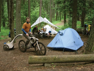
A bike for Abruzzo National Park by Alessio D’Onofrio

Wow! 2010 has been off to a busy start. I was hoping to get my review of the Batavus BUB urban bike posted before the end of the year, but I just can’t seem to find the time to sit down and write a few paragraphs. It is on my to do list for the coming week though, so look for that review soon.

Today, I want to quickly share a project from Italian architect and designer, Alessio D’Onofrio. Alessio worked on a thesis project titled “Inter-modal system aimed to the conscious and assisted fruition National Park of Abruzzo” as an architecture student at the University G. D’Annunzio Chieti-Pescara in 2006. He focused on a both a system and a product (the bicycle) to create a sustainable way for tourists to visit the Abruzzo National Park. Below you can read Alessio’s abstract describing his project, and see a few of the images from his slideshow presentation:

Introduction

The reflections about the theme of environment, suggested in this paper, come from the consideration that the Italian territory shows a large environmental estate, which has been scarcely developed, while the demand for eco-tourism has been increasing more and more.

The landscape of protected areas between development and defense

Italy owns an extraordinary natural protected estate, which needs to be defended and made accessible and comfortable to be lived. In order to love and defend the environment, it is necessary that use, fruition and preservation of our environmental heritage, become integral part of the estimation developing activity. All this requires both the promotion of environment resources knowledge and an action of design ethically responsible.

Strategy orientation and guidelines

In this perspective, the protected areas of parks, are the ideal scenery to make tests on new patterns of sustainable intervention without separating protection from development. Protected areas are surely required to defend the most sensitive and precious eco-systems due to biodiversity, but they are also an extraordinary instrument for the sustainable development in several strategy-sections like tourism, agricultural food production, craftsmanship and management of natural and environmental goods.

The sustainable solution

On the basis of these methods guidelines, the theme of sustainable mobility has been afforded in protected mountain areas. The application regards a project of an inter-modal System meant for tourist fruition in the National Park of Abruzzo.

The National Park of Abruzzo

The National Park of Abruzzo has been chosen as “sensitive landscape” for the particular
combination between spontaneous nature and landscape created by man on a land inhabited since long time ago, shaped and transformed by traditional culture and thousand year old civilizations (Lepore, 2001). In these last years, the problems connected to eco-development have been raised. That is, the need to harmonize the preservation and the urgent requirements by man of natural resources, between the maintenance of dynamic balance referred to eco-system structures and the necessity of socio-economic development of local population. In particular, the most relevant problem concerns the alteration of the environmental context due to the effect of man’s pressure submitted to a tourist-receptive system showing a high level of non-sustainability: increase of vehicle mobility inside the Park, surface, acoustic and air pollution, overall life quality decrease of the residents.

THE SERVICE:
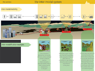
The inter-modal system for the conscious and assisted fruition of the National Park of Abruzzo

Inside a general pattern of strategy guidelines established by the Park Corporation, the sustainable solution which has been found responds to question on how it may be possible to manage and enhance the activities of tourist fruition in the Park, respecting the delicate environment balances. The proposal consists of an inter-modal System for the conscious and assisted fruition of the Park. The solution has been suggested as a service which provides information, assistance, minimal products and equipments for those who want to visit the Park by means of a resource management advanced service entrusted to the Park Corporation.

The system is a network spread all over the area of the Park and it is mainly based on different and interrelated transport modalities characterized by lighter ecological imprints as the demand of tourist fruition is shifted from the populated areas easier to be reached, to places of higher nature value and difficult to be reached (vehicle + electric shuttle + bike + walk).
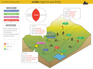
The service, in fact, includes several strategic points of inter-modal exchange that play also a role of support for the different leisure, sport, didactic and scientific activities. In these points the service offers information, assistance, maintenance, small equipments and products useful for the fruition of the Park. The service guarantees also a good system for collecting rubbish separately. Further, through satellite technology, the interaction between the service manager and the users of the Park is constantly and continuously updated. The service also requires the use of different tools like: digital media interfaces for first aid emergency, orientation and geographical, botanical, geological and zoological information, able to record texts as well as moving and fixed images, signs, furniture products and the small, light and flexible receptive structures spread on the territory of the Park in order to equip picnic areas as well as those meant for didactic, scientific and sport activities, electric bikes for going along the routes of the Park together with specialized supporting Kit to be used for the activities.

THE BICYCLE:
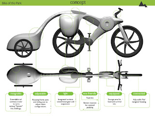
The product concept: the bike of the Park

The analysis of the service map has allowed to get its key-product: the “ Bike of the Park”. It consists of a vehicle made of two wheels, alternative to the traditional motorized mean of transport, meant for a tourist who feels responsible of his role searching in protected areas a fruition experience rich in content at social, cultural and environmental level. The context features, the strategy orientation of the Park Corporation, the targets and the list of service specific requirements have defined the project brief. The concept comes from the careful management of all the inputs coming from disciplines (ergonomics, environment requirements, material technology) where it is absolutely necessary to obtain from, to develop an object to be used according to the patterns of design.

The high quality formal product innovation consists of: experimental employment of carbon fiber, connection to the satellite information system, versatility (leisure activities, competition, transport of things), use adjustability, assisted cycling pace, equipment and service tools as part of the frame (universal case -kits for emergency, orientation and first aid, leisure, scientific, didactic activities exc.), a flexible bag for litter to be inserted under the saddle, joint trailer outfits, eco-compatibility according to the criteria of Life Cycle Design.


Posted

in

by

Comments

12 responses to “A bike for Abruzzo National Park by Alessio D’Onofrio”

  1. Anonymous Avatar
    Anonymous

    If this is how we're kicking off the year, I'm looking forward to a lot more student-designed CAD trash that simultaneously manages to reinvent the wheel while being utterly impractical. This guy should have taken the time it took to make those photoshop usage mockups to study existing bike technology so that he at least understood the problem. Nobody who has ever ridden a loaded touring bike or pulled a trailer would ever have designed anything like this hot garbage.

  2. James T. Avatar
    James T.

    …and this the comment to kick off the year? The blog is all about throwing out ideas and concepts for discussion. If you have a lot of experience riding a loaded touring bike or pulling a trailer, you should offer some constructive criticism that might help Alessio to further refine his concept. Criticism is always welcome, but it helps if there is more substance to it.

  3. Anonymous Avatar
    Anonymous

    James,

    Come off it, you know this design is totally unrealistic and not even worth critiquing. Every feature of these documents indicates that the designer had no intention of them ever becoming reality or even being submitted to those who might seek to improve them — they're clearly made to impress people who know nothing about cycling, not to put forward ideas in the world of actual bike design.

    I mean, for christ's sake, you're really telling me that hard shell panniers with nowhere for external lashing of gear shouldn't be laughed out of the room? That a trailer will ever function bobbing around on the end of a flexible pole? That a bike needs a frame-integrated trash bin? That having the pannier load that high would ever be stable on dirt trails? That that wheel design isn't garbage? That an offroad bike could have an unsuspended rear end cantilevered out that far and not have to be murderously heavy? Save for the smooth CAD and photoshop work, what can you point to about this design that doesn't give the same impression as a five year old's drawing of an airplane?

    For bicycles to be taken seriously as part of "inter-modal transportation" or whatever this jibberish is about, the people who design and think about them need to take their task seriously. You and I both know that this is unserious garbage. I may be harsh but the designer is wantonly ignorant of his subject and cynical about his task — who is the real source of negativity?

  4. James T. Avatar
    James T.

    Anon, who is the real source of negativity you ask? Umm…pretty sure it is still you…but I am referring more to your tone and word choice than the basic ideas behind your comments. I am glad that you pointed out specific elements of the design in your second comment, but it still comes across as more of a rant than a constructive comment.

    I will reiterate that criticism is always welcome on this blog, even from people such as you who wish to remain anonymous. Design critiques are an important part of the learning process, and any student who wants to make it as an industrial designer needs to develop a pretty thick skin. That said, criticism is best if it is specific and constructive. General statements “like this is garbage” (or on the flipside, “this is great") don’t really add much to the conversation.

  5. CorranThorn Avatar
    CorranThorn

    I don't know, I kinda agree with anonymous. If you load a bunch of extremely expensive parts onto a completely untested bike design, you're dealing with multiple infeasible subjects.

    Its kinda like he just chose a bunch of buzzwords and then made a bike out of them. I'm surprised we didn't hear something about cold fusion.

    Again, this is economically infeasible to deploy. Carbon fiber? Carbon fiber is ridiculously expensive, and is also hard on the environment with them using a variety of glues to keep the fibers together.

    And batteries aren't sustainable. People seem to think that they are. They aren't. Have you ever tried to dispose of a battery the "right way"?

    I think what Anonymous is trying to say is, even if this blog IS about throwing out ideas and concepts, I would have flunked him for his thesis because it fails at every step of the way.

    Oh, and I'm hoping you used some Italian auto-translator because the English grammar is making me puke. And if you did, you should've read over it to make sure it makes sense. All it needed was a few words removed here and there.

    Credibility is what I'm really getting at. How can a Bicycle Design blog praise such a horrible design? If you want to be credible, and instead of just spewing propaganda crap, give us your own opinion.

    A simple line at the end like, "While we applaud his intentions, clearly the bike design is economically impossible, environmentally infeasible and — for bicycling — it's unusable."

  6. James T. Avatar
    James T.

    Corran Thorn wrote, “Credibility is what I'm really getting at. How can a Bicycle Design blog praise such a horrible design? If you want to be credible, and instead of just spewing propaganda crap, give us your own opinion.”

    Corran, sometimes I share my opinion in a post and sometimes I simply pass along links or concepts so that readers can form their own opinions. It is really just a factor of the free time I have available in most cases. The blog is something I do for fun, so when work or family issues are pressing, my posts tend to be quickly written with little or no extra commentary. Other times, I do have the time to share my opinions and attempt to discuss the topic at hand in a little more “in depth”. Honestly, I wish I could put a lot of time into each and every post, but it is just not always possible.

    I agree that I could have corrected some of the grammar in Alessio’s text. English is obviously a second language for him, so a bit of minor editing for clarity’s sake might have been a good idea. At the time though, I was in a hurry and posted the text exactly as he wrote it. Confusing perhaps, but I don’t think lack of editing makes the blog any less credible. Bicycle Design may not be as polished as a big corporate site, but everything that I post, whether it contains commentary from me or not, is pretty much unfiltered. You may not always like the content, but I do think it is always presented in an honest fashion (in this case without praise or criticism from me).

    I will point out again that anyone can comment on any post, even if he or she chooses to remain anonymous as the previous commenter did. I may disagree, but I don’t EVER delete comments unless they are blatant spam or extremely offensive. I really do believe that differing opinions and real interactions with readers make the blog more interesting, for me and for everyone else. I will continue to share my personal opinions in posts when I have the time. Whether I do or don’t, you are welcome to leave your opinions here…even if you believe that I am “spewing propaganda crap”. I’ll have to disagree with you on that though.

  7. Azathoth Avatar
    Azathoth

    Yes, because we have gotten to where we are, not just in bikes, but in all tech, but just studying what has been done before and never trying anything new. Is this silly? Probably. Maybe it gives someone some totally different, tangential idea that does improve on current designs. Why bash someone when he/she is not using your time or money on it?

  8. shipshape Avatar
    shipshape

    I agree heartily with the above criticisms of the technical design. However, i think many of your readers are unwilling to approach this concept proposal on its merits as a system-design mockup. Not necessarily as a "new wheel," but as a new way of thinking about our national parks, national recreation, and how governments should or should not steward our natural spaces. Personally – I'm delighted to see a proposal for national parkland that features the bicycle. I'd love to see WAY less pavement in our national wilderness.

  9. Anonymous Avatar
    Anonymous

    "Yes, because we have gotten to where we are, not just in bikes, but in all tech, but just studying what has been done before and never trying anything new."

    Nope, we have gotten somewhere by trying something new after studying what has been done before, that's the step this designer skipped (besides knowing anything about materials).

    When a designer has neither technical expertise nor any real knowledge of the problem at hand, he's just a kid drawing an airplane with better crayons — "OMG guys it's going to have lazer beams coming out the front, and 19 engines so it goes really fast, and it's going to carry its own portable runway that it can land on anywhere, and it's going to have spikes all over it to stop enemies, and it's invisible and its radars can see through time and it's going to cost 25 cents to produce and get 10,000 MPG running on flat diet coke." If this bicycle "design" qualifies as useful because it happens to throw a few wild ideas out, I'm inviting a 6 year old to all my future design meetings.

    As for this bike considered in context of this whole multimodal whateverthedeuce plan for a national park, it's just a new version of the old myth that the only reason people aren't doing something is that the objects you need to do it aren't cool looking enough. It's fun to think that one man with a CAD program and a mouse can change the world just by taking an existing made object and smoothing out the lines, but it just doesn't work that way.

    The core idea proposed by these documents is that the main reason people aren't spending their holidays riding touring MTBs towing trailers instead of driving about is inadequate swoopyness in the design of the equipment. Secondary causes include the lack of an integrated trash receptacle and the insistence on tensioned spoke wheels. Conventional wheels are particularly offensive to the untalented designer not simply because the design is over a century old and has seen virtually no improvement through added swoopyness (and not for lack of people trying, either), but it is really, really difficult and boring to render in a CAD program.

    The Myth of Inadequate Swoopyness is a tolerable annoyance in cycling design when applied only to helmets — it's actually kind of charming to watch young optimists think that they have the magic design that packs enough swoopyness (or occasionally dandyness) to make people who don't wear helmets suddenly wear them. And the EPS molds are cheap enough and the product disposable enough that it doesn't really matter that a helmet can't be made to not touch the hair or not be larger than the human head or weigh less than about 250g or not have a chin strap any more than riding an off road touring rig can be made an unchallenging pursuit. But once in a while the myth gets out of hand, and you end up with a situation where a noble project like Trek's 161 initiative (a design and marketing campaign aimed at the 161 million Americans who don't bike) gets bogged down in swoopy designs and accessories. The result was the Lime, a CAD vomit design complete with a futuristic chain case and integrated personal electronics storage that became a colossal business failure and industry laughing stock.

    For the record, I'm really not all that critical of this blog for posting this stuff — if this is what young people are paying universities for the privilege of sitting around and mocking up all day, then I supposed that's what bicycle design amounts to right now, and if there's going to be a blog called Bicycle Design then that's part of what's going to be posted there. My gripe is with the designers who don't take their task seriously enough to do a little homework, and the teachers who let their students get away with work that displays no skill beyond CAD manipulation.

  10. Pixelman Avatar
    Pixelman

    Nice Pictures !
    Very nice concept !

  11. Pierfrancesco Avatar
    Pierfrancesco

    Anonimous non sei nessuno! (anonimous you ain’t nobody)

  12. […] a partir do blog Bicycle Design. -25.428356 […]

Leave a Reply

Your email address will not be published. Required fields are marked *