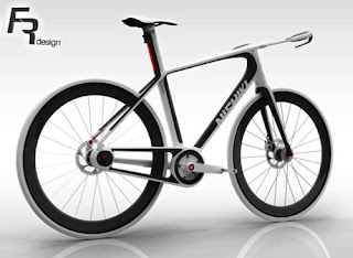
 I found Fredrik Rudenstam’s Nishiki urban commute concept bike while browsing though Coroflot portfolios this week. Rudenstam designed the carbon fiber commuter as part of his Master thesis project at the Jönköpings University in Sweden. The rendering doesn’t show any provision for cargo, but it is a good looking bike and the integrated LEDs are a nice touch. Fenders don’t seem to be an option either, which would be a dealbreaker for many commuters. I personally commute on a lightweight road bike with no fenders, so a bike like this would work for me if it had a small integrated rear rack for a light trunk pack.
ROBRADY design was recently awarded a Gold Spark award for the design of their db0 electric folding bike. You can read more about the bike and the award here and here.
Treehugger posted about the PUYL Tire Pump, which features an integrated LED light. The battery for the light recharges as the pump is used. Great design…but unfortunately only a prototype at this time.
Ecouterre posted about LFLECT, a line of reflective knit accessories that look like regular clothing by day but illuminate at night.
Cyclelicious points us to Cargo Bike Gallery, a great place to see various cargo bike deigns.
Finally I will mention LimitedHype’s visit to Trek’s headquarters. I linked to some of their pictures in an earlier post, but I don’t think I ever mentioned their post, which includes additional shots of the design department. It really is a great creative space.

Leave a Reply