A new bike rack design

I have mentioned the inverted-U bike rack design on the blog at least a couple of times before. In the NYC racks competition post I said:

[the inverted-U design is the] most functional design around. I like some of the artistic, sculptural bike racks that I have seen and I think they have their place, but really many of them function more as public art than as efficient bicycle parking solutions. To efficiently park the most bikes in a limited amount of outdoor space, nothing on the market beats the simple Inverted-U design.

A few years ago I worked on a proposal for a bicycle parking plan to present to the City of Greenville, SC. It is probably no surprise to any of you that inverted U racks were the type that I recommended. Yeah, we have established that I like that design, so when I received a message recently from David Rulon, an architect who was the designer behind the original inverted U rack, I was interested to see his latest idea.

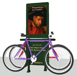
David points out that the new Bicycle Hitch 2 is an evolution of his original design. The new Bicycle Hitch 2 keeps the best ideas of the old one, while adding “major functional, aesthetic and “financial” improvements.” Rather than paraphrase, I will quote David on the features that he feels are advantages over his original design:

1. Bicycles are separated by enough space such that the pedals and handlebars do not interfere with each other

2. Bicycles can be secured in opposite or the same direction. The ends of the bicycles on each side of the hitching post align taking up less space and providing a neater appearance than the original Hitch-2.

3. The hitching post has separate and longer horizontal bars for each bicycle providing alternate locking locations and more space on which to rest the handlebars.

4. Optional high and low signs can be added in the space between the bikes providing a separation barrier. The lower sign could have the name, address etc of the sponsor of the bike rack (i.e. this person, business or group would pay for the rack and its installation in exchange for permanent advertising). The optional upper sign could be a mini-billboard which could be a source of revenue for the city. In some prominent locations this upper sign could be a back to back flat panel video screen possibly powered by a tubular photovoltaic collector integrated into the top frame of this sign. These video screens could be updated wirelessly.

5. This new hitching post is a more aesthetic and functional design with articulated joints and “feet”. The hitching post with the signs has a somewhat anthropomorphic shape giving the appearance of a person walking holding sandwich board advertisements.

6. A street tree or flat cartoon-like cutouts of historic, famous or political figures could be located in the space between the bikes in lieu of the high and low signs.

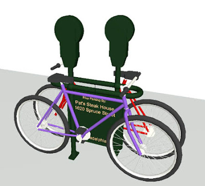
7. Hitching posts can incorporate parking meters to reduce street clutter.

Below you can see additional images and variations of the new Bicycle Hitch-2 racks. To show them in context, David included “images that show mid-block bicycle parking in which a car parking space is converted to bicycle parking at the sidewalk level. This sidewalk extension would provide a mid-block green space that is in a sense a mini-park with bike parking, benches and possibly other amenities. These sidewalk extensions would be restful places and may also have a tendency to slow traffic down.”

Posted

in

by

Comments

11 responses to “A new bike rack design”

  1. CrowMolly Avatar
    CrowMolly

    I don’t want to come across too negative, I really do like the concept. But… one of the attractions to the original is the simplicity. Would ad revenue really offset the additional manufacturing cost? Seems like an awful lot of welding. If the joints aren’t welded will they hold up to abuse? Also, the inverted U is almost impossible to vandalize. Thoughts?

  2. B. Nicholson Avatar
    B. Nicholson

    Just sink an old bicycle into wet concrete and let people chain their bicycles to the corpse? It would recycle old bikes with new purpose and confuse bicycle thieves.

  3. Anonymous Avatar
    Anonymous

    The inverted-U is called a Sheffield stand (at least here in the UK) and as crowmolly says it is simple and effective.

  4. Ron Avatar
    Ron

    James,

    This is a good improvement over the original Sheffield, in that 2 bikes can be ‘racked’ to the same unit, and adds more sites to provide stability to your equipment.

    But the footprint of such systems is still big. I love a minimalist design that thoughtfully supports the bike at or above its CG, doesn’t require reconcreting, and doesn’t have that ‘cluttering’ look. Reconcreting adds cost and prevents pavements from being used for a while by pedestrians.

    Besides, I always thought a hitch is something you hook to the end of your vehicle.

    I like the Cyclehoop rack system

  5. Yokota Fritz Avatar
    Yokota Fritz

    I like the lower part but don’t care for the higher profile of this new design.

    Have you seen the hoops that attach to parking meters and signposts? I like those also.

  6. Robert Anderson Avatar
    Robert Anderson

    This is an interesting bikerack design. For a wider discussion of bike rack design, including David Byrne’s and the unbelievable BikeTree of Switzerland, take a look here

  7. Anonymous Avatar
    Anonymous

    I really dont like this design. There are better ones which are much easier to use and install.

  8. Anonymous Avatar
    Anonymous

    Great blog. I wish it were updated more often though.

  9. James Avatar
    James

    The thing I like about this type of design is that it separates the bikes so, for instance, the pedals from one don’t scratch the frame of another. That separation also prevents someone from accidentally locking their bike to someone elses. I doubt that is very common, but I have seen it done. That said, I still really like the original inverted U design for its simplicity.

    Ron and Fritz, I have seen those locks that you mentioned that attach to signs and poles. It seems like a good idea to me.

    Robert, thanks for the link.

    Anon 5:44, Glad you like the blog. I wish I could post more often, but I just don’t have the time to do so. Such is life.

  10. Jacob Avatar
    Jacob

    nice pictures

  11. Anonymous Avatar
    Anonymous

    I would like to offer the following response to some of the comments I have seen on James Thomas’ blog Bicycle Design (http://bicycledesign.blogspot.com/)regarding the re-conceived “Hitch-2” bike rack that I have designed.

    First I would like to say that I agree with all of the comments that James made with regard to NYC bike rack competition and the winning “Hoop” design. It is a very elegant design that will make nice street furniture.

    In terms of the comments made about the “Hitch-2” I would preface my comments with a note that I am an architect first and a bicyclist second and look at things from that perspective. When I originally conceived the “Hitch-2” bike rack in the 1970’s I was reacting to the current and prevalent bike rack designs that were being put in everywhere. These designs were mostly about how to lock a bike securely. This is the number one priority for a bike rack but not the only one. Aesthetics and friendliness to pedestrians did not seem to be of great concern. Looking around at what other bicyclists did and knowing what I always looked for to which to lock my bike it seemed a simple railing or post were the preferred objects. Since most people carried “Kryptonite” type locks this worked well in terms of security.

    The original “Hitch-2” was never a great piece of aesthetic design as has been noted in numerous writings and comments and I would certainly agree. I think the things that have made it so popular and ubiquitous are that it works on several levels. It is simple, flexible, secure, can be easily and safely placed on sidewalks or public ways, can be clustered for multiple parking spaces, is aesthetically unobtrusive and requires no instructions on how to use it.

    In terms of the new “Hitch-2”, the majority of comments seem to center around the cost of the bike rack and that it is less simple than the original. Although I do not yet know what the costs of the new “Hitch-2” will be in volume, it is likely that it will be more expensive than the original. Cost is always an issue but I would argue that these bike racks are typically a piece of street furniture in the public way and should be looked at from that perspective. Cities or towns generally do not (or should not) scrimp on park benches, bus stops, kiosks, and waste containers. Bike racks should fall into that category. They will be in place for many years (hopefully) and because of that they need to be substantial and aesthetically pleasing. This usually means that the costs will be higher but I believe the investment is worth it.

    In terms of the simplicity issue, I again would agree that this new design is not as simple as the original but it still is simple and works the same way as the original design only better. The bikes are now separated so that pedals, handlebars and other protruding items on one bike will not generally conflict with the bike on the other the other side. It also offers more locations and flexibility in terms of locking options.

    My last comment is regarding street furniture in general and bike racks in particular. Streets and sidewalks are vital and important elements of any city or town. These public spaces must be carefully and thoughtfully designed. Sidewalks are limited in size and any objects that are placed in that space must serve the public and their purpose well. Where possible these objects can better serve the public good if they can offer multiple uses within the same space. The re-concieved Hitch-2 attempts to do that by providing options for pubic service and/or advertising signage, street tree protection and the incorporation of parking meters. These bike racks mounted either singularly along the sidewalk or in groups also serve as a subtle form of protection for pedestrians from the vehicles on the street.

    I welcome additional comments, suggestions and critiques to improve the design.

    David Rulon

Leave a Reply

Your email address will not be published. Required fields are marked *