Beauty is in the eye of the beholder

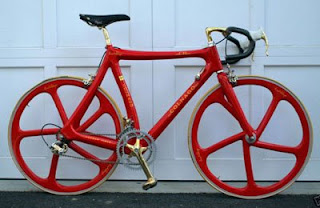
I guess that explains why this early nineties carbon fiber Ferrari Colnago C35 with gold plated C-record components is up to 6 grand on eBay with 2 days still to go. When I saw this bike earlier today at a Cozy Beehive post, it brought back memories of the late 80s when ads for Italian bikes with limited edition gold plated parts were everywhere. I didn’t understand the appeal then and I still just don’t get it. In the case of this bike though, it’s not just the gold plated groupo that I don’t like. The curve of the seat tube, the bulge of the chainstay and seatstay intersection near the dropouts, even the relationship between the angular wheels and the frame, all combine to make this bike look a bit whacked (to use a technical term). Of course, that is just my opinion. I have mentioned the old Ferrari/Colnago bikes before and it is probably no secret that they just don’t appeal to me. Obviously though, some people DO like them and are quite interested in this bike in particular, as a collectors item or for whatever reason. I guess that brings me to the point of this post; I am glad that not everyone likes the exact same things that I do. As I commented over at the Beehive, aesthetics are subjective and I think that is a very good thing. Certain forms, colors, etc appeal to different groups of people and that is one of the factors that makes design an interesting profession.

I know that by posting my opinion about this bike, I am opening myself up to negative comments from the legions of gold plated Italian component fans on the web. Before I alienate that group like I did the top tube sporting fixie crowd, I want to say this; if you like this kind of stuff, I encourage you to buy this bike and ride it proudly. Just because I don’t like it doesn’t mean someone else shouldn’t. If you do buy it though, I have one suggestion; you might want to consider having a custom gold pad made for that crazy swaybacked top tube.


Posted

in

by

Comments

18 responses to “Beauty is in the eye of the beholder”

  1. thePig Avatar
    thePig

    I can’t imagine feeling comfortable being out on the road on this bike, although isn’t red supposed to go faster.

  2. jimmythefly Avatar
    jimmythefly

    I used to hate gold accents on stuff -mostly because I always saw it on a Cadillac. Then I saw a red Miura with gold Campagnolo mags, and it all made sense. Gold accents on Italian bikes, especially ones associated with italian autos, are perfectly Ok in my book. As much as I dislike these car/bike specials, I can understand and maybe forgive it in this case.

  3. bikesgonewild Avatar
    bikesgonewild

    …well, it certainly is red…but the combination of a lotta the details adds up to a rather inelegant bicycle…
    …production molded carbon fiber framesets were still basically in their infancy in the early ’90’s…vitus was making carbon fiber tubed, aluminum lugged frames a decade before & craig calfee was bonding his carbon lugged framesets by ’88 but metal matrix, for lightness & stiffness was the big buzz phrase at that time…
    …molded carbon was being done but most of the work from that era was not particularly lightweight & seemed to have a “clunky” element to them, like the rear stays & dropout of that c-35…

    …& jimmythefly nailed it by mentioning his remembrance of the miura w/ gold campagnolo mags…ferrari factory raced plenty of red sports-racing & F-1 cars throughout the ’60’s & beyond w/ gold campagnolo & cromodora mags…somehow they all looked better than the tribute bicycles…

    …but as you imply, james, to each his own…

  4. Bas Avatar
    Bas

    I hope you’re not one of those foolish Japanese riders, italian components are the best thing to happen to cycling since inflatable tires! I gotta agree on the color choice though, black is waaay more stylish than gold!

  5. Art Avatar
    Art

    It’s not the gold that’s bothering me (If you’re going to build a bike to not be ridden, why not go all out?) so much as the lines on that frame. It was built at a time when the possibilities of carbon fiber far overshot the current manufacturing realities. A little more restraint on the top and seat tubes would have gone a long way toward a more unified look. At a time when Ferrari’s cars had very linear bodywork, it seems silly to throw two curves into the bike frame just because they could.

  6. James Avatar
    James

    I was hoping that not everyone would agree with me on this.

    Pig, I doubt that whoever buys it will even ride it, so that probably won’t be an issue.

    Jimmythefly, good point. I am not a big fan of later Lamborghini styling, but those 60’s and 70’s Miuras do look good with gold rims. To be fair, I have seen some old Italian bikes with gold accents that look better than others.

    Bikesgonewild, it is true that it is not really fair to compare a 1991 molded carbon frame to today’s bikes. Due to the nature of the material and process, molded carbon frames of that era were chunky compared to the forms we are used to now. S,till some were much better than others. I worked for a shop that was a Kestrel dealer in the late 80s/early 90s. Those early bikes, like the Kestrel 4000, looked great at the time and the forms still look nice today.

    Bas, I am definitely one of those foolish Japanese riders. I was a big Campy fan many years ago, but I choose Dura Ace over Record for the road these days. Campagnolo is doing a few interesting things right now, but for a long time Shimano was doing all the innovating while Campy was playing catch up . Of course, I am talking about fairly recent innovations like indexed shifting, STI, dual pivot calipers etc. I am obviously a big fan of derailleurs and quick release levers, but really, what has Campy done in the last 10 or 15 years? At least they finally got away from the square taper bottom bracket, but I would like to see more from them. I admit that some details of the Record groupo are nice (like the hidden shifter cables, I am glad that DA shifters are finally coming around), but I just can’t justify paying 600 bucks for a Record crankset when it looks like they just ported the old C record design over to that marbleized carbon.

    Maybe I am oversimplifying my opinion just to be controversial. For the record, I should say that I still have quite a few Italian components from the nineties. My Pinarello track bike is built up with the Ofmega pista group, so I guess I still have some fondness for old Italian stuff. I just want to see Italian component makers take the lead from a product development standpoint. There are certainly pro and cons to Shimano and Campy groups, but I think Shimano has the lead when it comes to design and engineering.

    Art, I am with you, the lines of the bike are what really bother me. I can pick on the gold finish, but the form itself is what I find unappealing.

  7. James Avatar
    James

    Oops, I have a correction. I must have been having a brain lapse when I typed that last comment. I meant to say that my old Pinarello has Gipiemme Special Pista components, not Ofmega. Yet another Italian brand besides Campy.

  8. JM Avatar
    JM

    If that bike were a person, its shirt would be unbuttoned down to its navel, showcasing several gold chains atop a bouquet of chest hair.

  9. bikesgonewild Avatar
    bikesgonewild

    …jm…i think you’re right…

    …james, i’m not fully knowledgeable about the subject but i do know for a fact that shimano was very much into patenting any ideas they came up w/ so that others couldn’t pursue that particular path, whether they (shimano) were going to use it or not…
    …campagnolo didn’t continue to pursue the mtb component market partially because certain avenues were closed to them…

    …that’s why sram corps bold move in light of certain nullifying factors is such a great step…

    …my point would be simply that there is a whole back side of the biz that we’re generally not privy too…

  10. Geoff Avatar
    Geoff

    Make the gold components a little more yellowish and Ronald McDonald could race it.

  11. Art Avatar
    Art

    Campy can be forgiven for holding onto the C Record crank design for so long. It was after all one of the hottest looking components ever made.

  12. Robin Capper Avatar
    Robin Capper

    “As flash as a rat with a gold tooth” was my first thought. I like Ferrari but some of their “merchandise” is far from classy.

  13. Did You Know? Avatar
    Did You Know?

    beauty is in the eye of the beholder is one of my favorite saying.. the bike is nice

  14. David Avatar
    David

    Okay, James, I’m disagreeing with you on this one. Actually, while I have the greatest respect for your knowledge (design, etc.) … I’m not overly keen on the hyper-race styles (and their graphics) that you usually feature.

    The style is appealing, to me, because of the uniformity (within a range) of the frame ‘tube’ dimensions, angles and curvatures. NIcely integrated, in that sense, I believe. Of course, ride-wise I have no idea how it would be.

    My ‘realm’ of interest in cycling is primarily lugged steel … fully equipped: fenders, rack(s), etc. Also, all utilitarian cargo work cycles … which have a ‘high style’ all their own. I do appreciate the bare roadster (road racer … ) styles, I am partial to restraint with use of stickers/logos/’wording’/etc. And so, this particular Colnago has a certain appeal.

    Actually, it’s not so much that I like it, but that I dislike it less than so many ‘flashy’ race bikes … with stickers all over, crazy paint. As for unnecessary ‘curves’ of the tubes just ‘for the sake of it’ … compare that to the new bikes common nowadays (even cheap ones) with full suspension on road bikes, for instance.

  15. carlos Avatar
    carlos

    Well, on the point of the colors, I personally associate gold color with luxury wearable stuff, like jewelry, watches, and baroque home decorating stuff. So luxury semiotic is not for racing machines, (road bicycles for example). The racing aesthetic (in my opinion of course) is hardest and most communicate hi tec, so blacks and opaque metals are maybe better for it.
    Even as the campy user that I am, I recognize that campy has been very conservative, as shimano has been leading on engineering innovations and aesthetics. However when I chose campy for my road set, one of the reasons that I remember was the fact that, campy shifters, are designed to cover the cables with bar tape, and I still like that because makes look the handle bar clean. Many years later, I realize that shimano was clearly changing elegance by hand comfort and usability.

  16. gob Avatar
    gob

    How is it that Campagnolo has had hidden shifter cables since they introduced ergopower, carbon levers, cranks, and derailleur cages for at least 2 and up to 5 years before any other component manufacturer, and yet they are still considered conservative? You pooh-pooh Campy’s first generation carbon crank for costing $600, but Shimano’s first carbon crank, 4 years later and costing $1200 is magical and will propell us all up the Alpe d’Huez faster than a Shleck brother on a sudafed buzz?

  17. James Avatar
    James

    Thanks for the comments everyone. Like I said in the post, styling is subjective so I appreciate those of you who have shared different opinions here in the comments section. Hearing from others is what makes the blog fun, so I appreciate all the different thoughts.

  18. rmrmetalfab Avatar
    rmrmetalfab

    i own such a bike.,,frame fork only with campy 10 components… its a collectable bike ..one of 2 known in the philippine islands. kinda heavy..but i did race it with good results.

    if you want to see how the collectors are building up this bike…

    see my blogspot http://www.rocka1bikeshop.blogspot.com

    raymond see

Leave a Reply

Your email address will not be published. Required fields are marked *