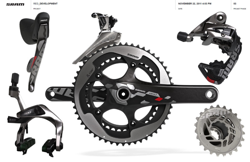
 I am assuming that the majority of you have already seen images of the new SRAM Red 2012 group, which was unveiled last week after several months of anticipation. If you somehow missed it, see the posts at Bike Radar, Road.cc, BikeRumor, and this video at VeloNews (just to name a few). I was pretty impressed when I finally saw the redesigned group in its entirety, so I shot an email over to the designers at SRAM to find out more about it. Earlier this week, I had the chance to talk with a few of the industrial designers who worked on the project- Paul, Nathan, and Jochen. It was a very interesting conversation from which I can only share a limited amount in one blog post, but I want to try and give you a brief glimpse into the development process behind this new group.
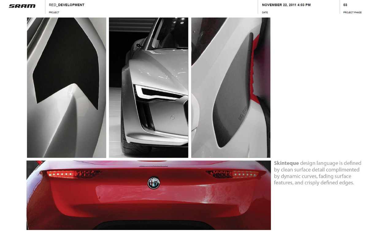
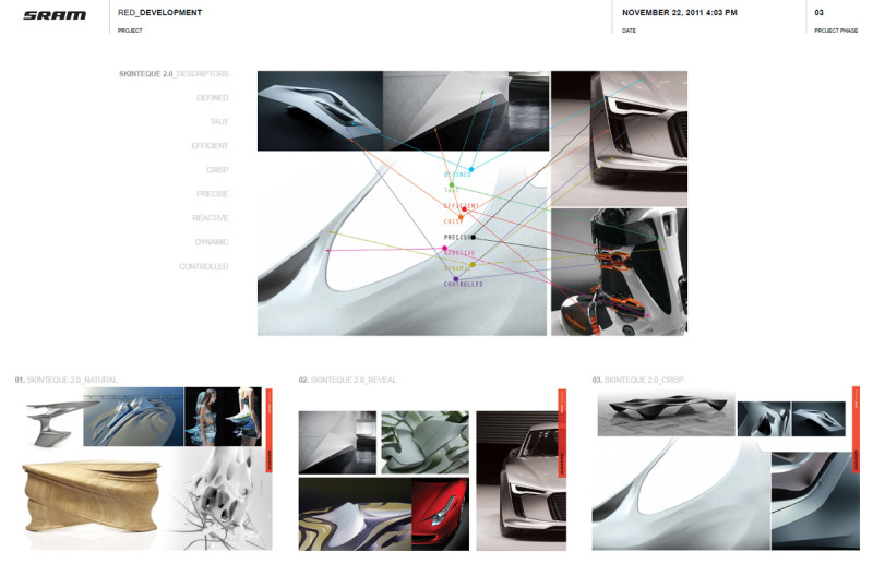 The Industrial Design group started the Red update project with a few key new technologies that came directly from SRAM’s advanced engineering group (including trim-less front shifting and a multi-link brake design). From the onset of the project, the industrial designers set out to use efficient, aerodynamic forms that exemplified those underlying technologies. The global design team for the project included industrial designers, graphic designers, design engineers, and finish engineers in the US (Chicago and San Luis Obispo), Germany (Schweinfurt), and Taiwan (Taichung). In order to create a cohesive group and maintain consistency between the emerging forms, it was critical for each member of the design team to work within a defined form language. Several years ago, SRAM designers had coined the term “Skinteque” to refer to a design language “defined by clean surface detail complimented by dynamic curves, fading surface features, and crisply defined edges.” Each member of the team used that predetermined form language, and the associated image boards, as a visual guide as they conceptualized the various components within the gruppo.
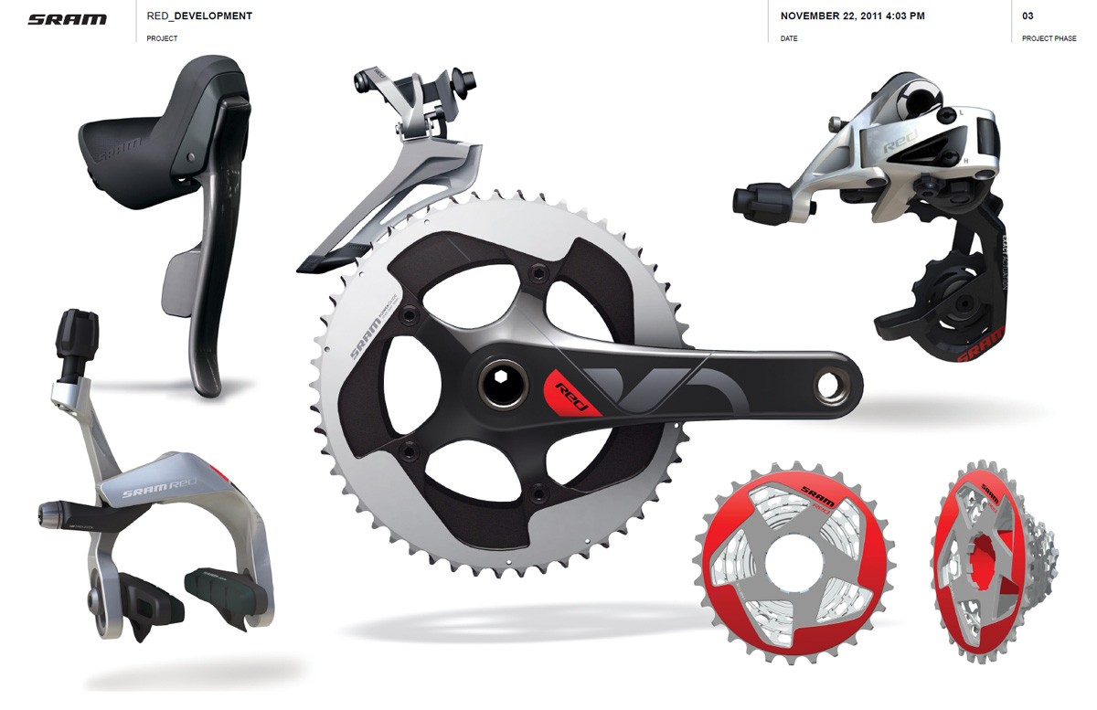
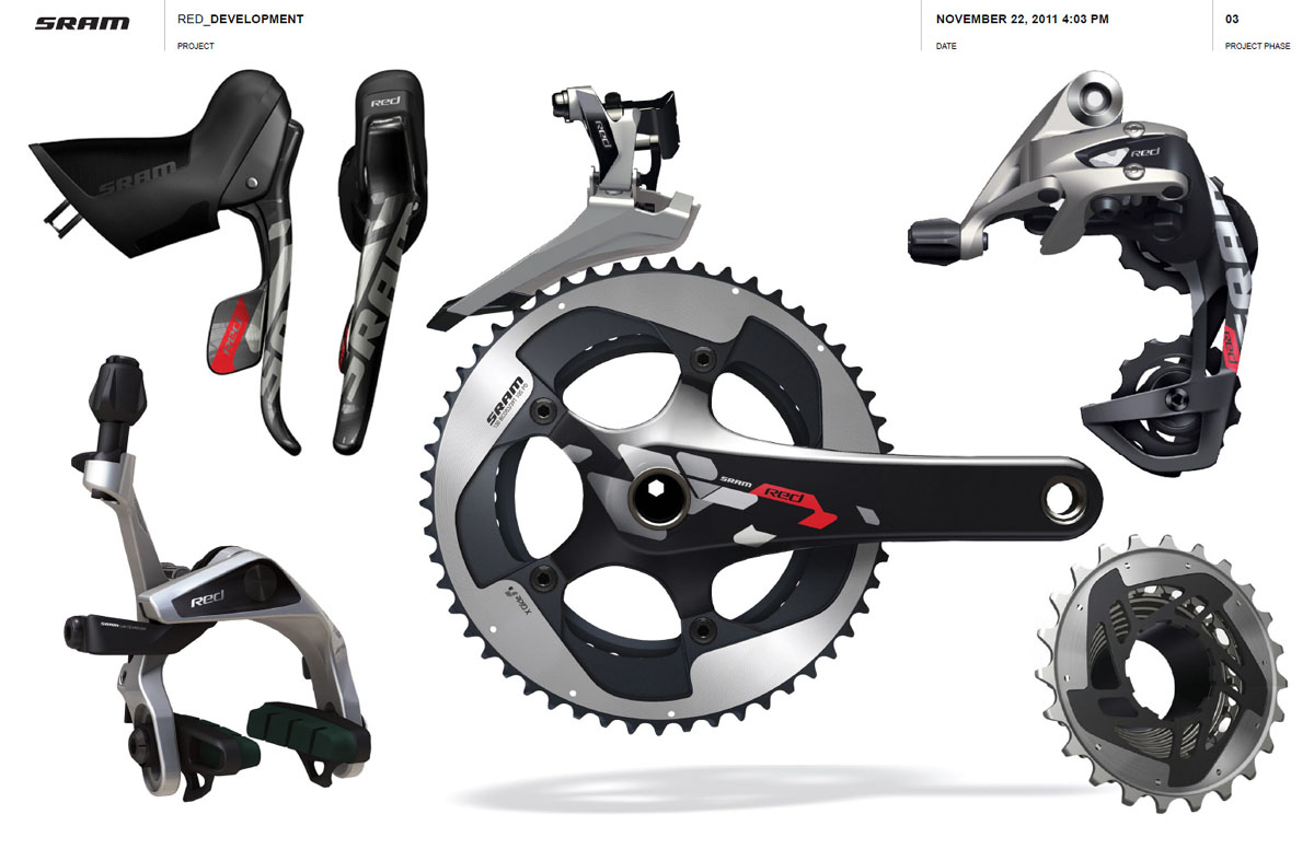
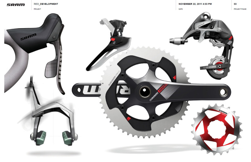 On a weekly basis, the team met virtually to view and discuss the components, at various stages of development, as a group. That “live-updated virtual gruppo” (as seen in the sample image here) allowed the design team to work together from points all around the globe to create a group with a unified aesthetic. One of the common elements that tie the parts within this new Red group together as a cohesive whole is the finish treatment. Because it is SRAM’s top tier “pro-level” group, the design team focused on creating a cohesive, high-end finish from the very beginning of the project. The finish and graphic treatment on each of the components was not an afterthought, but was an integral part of the process as the forms were developed. The industrial designers, graphic designers, and finish engineers worked together with the various factories to maintain that integral finish treatment throughout the gruppo, despite different materials and manufacturing processes.
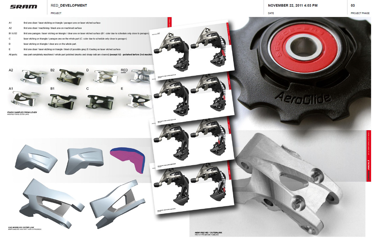
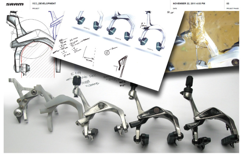 The board shown here illustrates the progression of the “Aero Link” multilink brake calipers, which is a good component to discuss a bit further. The design development team started the brake redesign with the CNCed functional prototype from the advanced engineering team that you see on the far left. They sketched and 3d modeled forms to refine the rough engineering sample, and used 3d printed parts (as shown in the 2nd position) to verify the form and check interference. Once the basic shapes were defined, they created working prototypes from machined aluminum and continually refined the form to the final one. Even with the forms almost finalized though, there were still quite a few detail issues for the team to work through. Seemingly small details like the black paint detail in the recessed section of the caliper required multiple drawing revisions from the industrial designers, graphic designers, and finish engineers. Maintaining precise placement of the black painted section, with a reversed out logo, on forged parts that are tumbled, polished, and anodized is trickier than it seems, and required the designers to work very closely with the manufacturers to get it just right. The brakes are just one example, but you can look at the relationship between finish and form on other parts, like the rear derailleur or chainring, and find the same subtle complexities.
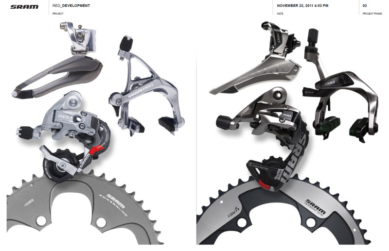 The image board which shows the older group and the new group side by side does a good job of illustrating the cohesive design language that was achieved with the redesign. The common forms, finishes, and graphic treatment give the new Red group a much more unified appearance than its predecessor, and I think put it ahead of Dura-Ace 7900 as the best looking gruppo on the market. That is just my opinion of course, but I think most would agree that the designers and engineers at SRAM did a good job improving on Red from both a technical and aesthetic standpoint. Personally, I have been riding Dura-Ace for a long time, but this new group, and hints of components soon to come, may be enough to convince me to “make the leap.”
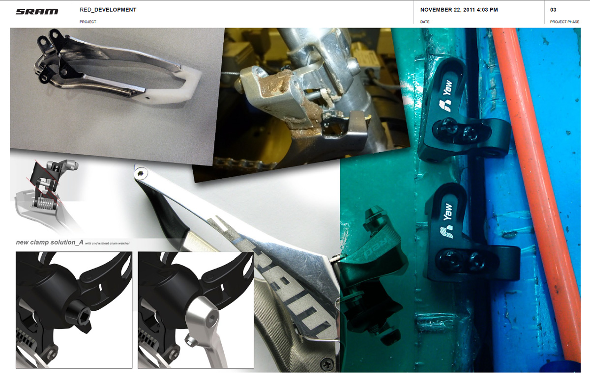
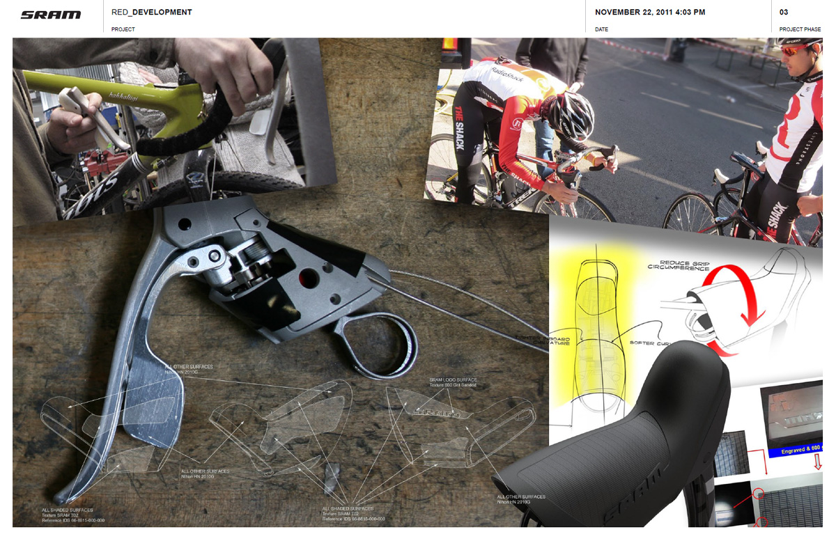
See a few more of the design development boards from the Red project below.

Leave a Reply