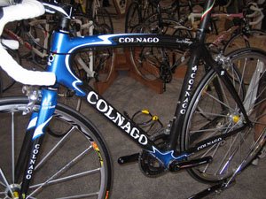
 I shared a few thoughts on the trend toward curved top tubes on road bikes last year. It appears that there are plenty of those bikes at Interbike again this time around. Why not? After all, some of them look pretty nice. Besides you can make any shape you want with carbon, right? I am not at all against the idea of adding curves, but just because you CAN make any shape out of carbon doesn’t mean that you necessarily SHOULD (see my comment about the DeRosa Tango last year). Okay, Okay, I am starting to deviate from the point, so let’s get back to curved top tubes in particular. Sometimes they seem to be an integral part of the frame design and other times they appear to be a bit of a forced design element. It is sometimes hard to pinpoint why, but in many cases, the frame graphics can really help to unify the design. I think the Colnago pictured here is a good example of that. Whether you like the wavy blue accents or not, they do work well with the shape of this frame. In my opinion, Seven’s new V.11 (seen here and here) has a graphics scheme that does not work quite as well with its curved top tube. The Seven looks like a nice bike and it is interesting how the head and down tubes wrap around the head tube, but, to me, the graphics just don’t compliment the shape of the frame. Maybe you disagree. If so, let me know.
The way that colors and accent graphics integrate with complex frame shapes is becoming more and more important in the bicycle industry, especially at the high end. I think companies like Ridley and Orbea are leading the way in that regard (take a look at a Noah or an Orca to see what I mean). Of course, I probably shouldn’t point out just those two companies. Look at photos of all the bikes at Interbike this year and you will see that, in general, all bike manufacturers are paying more attention to color and form. Expect to see more attention to this in the future, as design becomes an even bigger differentiator between the many similar bikes on the market.
Photo from mtbr.com’s Interbike coverage
Leave a Reply to David Cancel reply